Creative Art Input Thread

Argentus

Well-Known Member
As I have noticed there are a lot of talented artists here, I thought it may be worthwhile to have a thread for people to help each other out with their art with input and answers.


For example, I'm concepting characters for a comic I'm trying to get back to when I have q computer again, and id love feedback as I design them, as well as help with things in Photoshop, like how to do lighting, liquids, etc.

To any who wish to give input or feedback, all is appreciated, and to any who wish to ask for it, all is welcome.


For the record, squiggly horizontal line next to something is my shorthand for "meh", as in I wasn't happy with the idea or the art.


********************

To begin with, I sketched a rough character sheet as a starting point.

10515181_1474556856128038_4934612690641828963_o.jpg


And from there I've been concepting them out.

1909513_1483403805243343_5833187021670559669_o.jpg


As for specific things, I'm having trouble deciding if the fox girl should be leaner like above, which I feel makes for a prettier, more mature face, or more like this with a curvier body, and a rounder, cuter face. Thoughts?

(No particular inspirations for this character)

10496247_1474551809461876_1497123568728858253_o.jpg


For her coloring, I have a personal rule there must be a unique spin on each character. On her case, she's actually a gray fox, so the gray/red/white/ brown speckled fur pattern has been a pain. Not sure how to apply that. I am also debating if I should have the underside of her arms and thighs as white like the belly of an actual fox. (Not her belly, she's standing upright so it makes no sense)


Then for Lily, the fairy girl, her original simplistic design...having trouble drawing her hair at various angles. But wound up trying a different design that I also love but not willing to give up old design. Thoughts on both?

(Inspirations for this one being Lilymon from digimon, fuu from naruto, Tinkerbell, the girl from Ferngully, and a girl I knew from elementary school)


10548313_1488461641404226_5573261081953544027_o.jpg


I had also tried a redesign on a courier, thinking he needs to get around, like assassins creed. The single stripe is part of his uniform while the bandolier on it forms an X. Not sure if I should keep the bqndolier or not.

10497500_1488702604713463_1458310020797219604_o.jpg


***********************

In terms of environments and coloring, here's some of the first few pages of the comic I started. I have no idea how to do textures, chrome, or water surfaces. I feel like I did a decent job with shading and trees though.

981836_1436707433246314_941573810824180834_o.jpg

10258990_1436707466579644_8260863249697834761_o.jpg


I know I have trouble with anatomy, proportions, and clothing details.

Again any feedback or input or suggestions, whether it be the actual design, or my admittedly terrible art skills, is all apprrcciated, and hopefully this becomes a worthwhile thread where people can suggest ideas and techniques.
 
Last edited:

Awesmic

Well-Known Member
Standard Donor
View attachment 7111
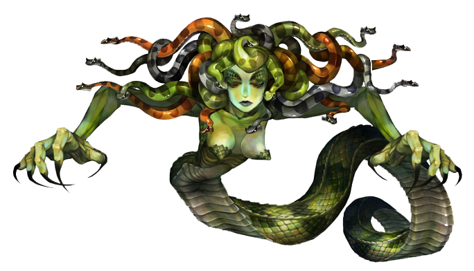
unfinished painting of Medusa (Original Depiction)
shes crying because she's afraid to open her eyes, based on my personal struggle with making eye contact with people. Her spine is contorted to make her appear more serpent like.
I can't help but believe this was totally inspired by the modern Clash of the Titans Medusa design.
 

Argentus

Well-Known Member
View attachment 7111
unfinished painting of Medusa (Original Depiction)
shes crying because she's afraid to open her eyes, based on my personal struggle with making eye contact with people. Her spine is contorted to make her appear more serpent like.
I love it though I do have one critique if I may.

Shouldn't the ribs extend further down (more ribs) and the naval be further down to give her a more "extended" look?

That or the "dress" not going as far down, starting just below the naval? As is, it looks like something is missing with that skin gap.

But good regardless.
 

Argentus

Well-Known Member
All of the above? and who is she, her name, her background.
Without spoilers, she is who I'm named after. Sylviana "Sylvie" Argentus (roughly means Forest Of Silver" . A gray fox race that function similar to wood elves. First child of the new generation, though her parents are killed and she is taken in by Silvair who saves her from the same fate. From there she lives and travels with him, kinda being the sidekick/partner. However what seperates her from a standard cute tagalong is the plot twists, plus the fact that she is a) a wild animal without ethics of civilization, and b) a fox.

What the former means is that she can still be a cute happy go lucky girl while being a vicious killer without being crazy, because death is a normal thing in nature.

What the latter means is that she's a lot more capable and cunning than people give her credit for. She's the one who can work with and reign in the psychotically uncontrollable Silvair, after all.

She's effectively the sane man of the cast.

Debating if she'll be the romantic interest but its likely.

Do you think she looks better curvier with a founder face there or leaner with a thinner face like the other two pics?
 

Argentus

Well-Known Member
Trying out a different paint style... This was supposed to be a real life Juri until I realized I have no idea what she'd actually look like. So you kinda have to use your imagination until I get the face right. If anyone has model suggestions that'd be cool too

juritest1b_zps7c676193.jpg~original
I imagine like uma Thurman in pulp fiction. But yak now, Asian.

Always hard to be realistic from an anime face, especially since most anime noses are....slight, at best.

i think she looks better Curvier with a founder face. I'd like to see you carry on with it :)

Alright then. Any of the other characters in thag little lineup catch your eye at all?
 

Tirahrr

Active Member
Again any feedback or input or suggestions, whether it be the actual design, or my admittedly terrible art skills, is all apprrcciated, and hopefully this becomes a worthwhile thread where people can suggest ideas and techniques.

Hi, sorry it took me so long to reply to this thread. When it was made I really didn't have the time, and then I forgot all about it. >.<

Anyway, where to start ...

Firstly, with the fox girl. I personally think she looks better with curves but I think a great trick to help you decide is to draw the girl twice in normal standing positions right next to each other, and draw one skinny and one curvy and then choose. I know it helps me decide which I prefer when I place the characters/objects right next to each other in the same position; a lot easier to compare.

Since you also use the PC to draw, an even easier way is to draw the skinnier girl first and copy and paste the second version of her next to the other. Then proceed to draw over the second one on a new layer, making her curvier and erase the original skinnier body underneath.

About her fur; use reference and try to emulate it the best you can is all I can say. Same can be said about a lot of things you're having trouble with. Use reference and just practice. For furries, the fur doesn't really have to look like fur anyway, you can just make a kind of gradient effect as one colour blends into the next. Also I think the white under her thighs and arms would look good, I think on the belly could work too actually. Most furries I've seen are like that.

As for Lily, both hairstyles look nice. With the hair you're having trouble drawing, just google bob hairstyle and you'll see some side profile shots you can use as reference. I think the problem is you're drawing the longer side too far forward, especially from the side profile.

For the Assassin, I like the x look. If need be, try drawing it again with the bandolier on the same side as the stripe, see if you like that better.

As for your comic, I think your shading is great on the character. I'm not great at environments either, but as I've been stating throughout this; reference really helps.

For the tree texture, I usually use a smoothed over, table top kind of wood look as it's easier to get the point across even if it's not accurate to use with all trees. With the texture you used, your tree looks kinda furry. Try something like one of these, with the circles/swirls in it:
http://thingsinjars.com/uploaded/images/expanded/wooden-panel.jpg
http://fc01.deviantart.net/fs70/i/2013/041/c/4/wood_texture_vectors_by_iemersonrosa-d5nzt1t.png
http://fc08.deviantart.net/fs70/f/2011/353/3/2/111219_ro___christmas_in_lutie_by_tirrany-d4jjvj2.jpg (first picture I could find of my own to use as an easy example, I just draw swirls and lines as you can see the in the background)

Anyway, I think that's it. Sorry this reply is so late!

I need to start drawing stuff that isn't for contests/other people again and share it on here. >.<
 

Argentus

Well-Known Member
Hi, sorry it took me so long to reply to this thread. When it was made I really didn't have the time, and then I forgot all about it. >.<

Anyway, where to start ...

Firstly, with the fox girl. I personally think she looks better with curves but I think a great trick to help you decide is to draw the girl twice in normal standing positions right next to each other, and draw one skinny and one curvy and then choose. I know it helps me decide which I prefer when I place the characters/objects right next to each other in the same position; a lot easier to compare.

Since you also use the PC to draw, an even easier way is to draw the skinnier girl first and copy and paste the second version of her next to the other. Then proceed to draw over the second one on a new layer, making her curvier and erase the original skinnier body underneath.

About her fur; use reference and try to emulate it the best you can is all I can say. Same can be said about a lot of things you're having trouble with. Use reference and just practice. For furries, the fur doesn't really have to look like fur anyway, you can just make a kind of gradient effect as one colour blends into the next. Also I think the white under her thighs and arms would look good, I think on the belly could work too actually. Most furries I've seen are like that.

As for Lily, both hairstyles look nice. With the hair you're having trouble drawing, just google bob hairstyle and you'll see some side profile shots you can use as reference. I think the problem is you're drawing the longer side too far forward, especially from the side profile.

For the Assassin, I like the x look. If need be, try drawing it again with the bandolier on the same side as the stripe, see if you like that better.

As for your comic, I think your shading is great on the character. I'm not great at environments either, but as I've been stating throughout this; reference really helps.

For the tree texture, I usually use a smoothed over, table top kind of wood look as it's easier to get the point across even if it's not accurate to use with all trees. With the texture you used, your tree looks kinda furry. Try something like one of these, with the circles/swirls in it:
http://thingsinjars.com/uploaded/images/expanded/wooden-panel.jpg
http://fc01.deviantart.net/fs70/i/2013/041/c/4/wood_texture_vectors_by_iemersonrosa-d5nzt1t.png
http://fc08.deviantart.net/fs70/f/2011/353/3/2/111219_ro___christmas_in_lutie_by_tirrany-d4jjvj2.jpg (first picture I could find of my own to use as an easy example, I just draw swirls and lines as you can see the in the background)

Anyway, I think that's it. Sorry this reply is so late!

I need to start drawing stuff that isn't for contests/other people again and share it on here. >.<
Muchos danke!

Tbw original concept of her was curvy anyways just need to make sure she doesn't look too thick to be agile.

As for the tree looking furry....awesome! That's what I was going for! I was going for the thick trees where the bark is kinda husky and almost fuzzy. That combined with moss.

On the assassin. Trying to keep in mind the uniform is maroon, gold and black. Like the guy in the comic.

On Lily...yeah that's probably it. Do you have any preference on which version you like better? The more regal version of the kiddyer version?


Thanks for all the tips. I don't have a PC at the moment but when I do I'll be happy to actually implement the advice lol.
 

Tirahrr

Active Member
Muchos danke!

Tbw original concept of her was curvy anyways just need to make sure she doesn't look too thick to be agile.

As for the tree looking furry....awesome! That's what I was going for! I was going for the thick trees where the bark is kinda husky and almost fuzzy. That combined with moss.

On the assassin. Trying to keep in mind the uniform is maroon, gold and black. Like the guy in the comic.

On Lily...yeah that's probably it. Do you have any preference on which version you like better? The more regal version of the kiddyer version?


Thanks for all the tips. I don't have a PC at the moment but when I do I'll be happy to actually implement the advice lol.
Oh, I forgot trees can be fuzzy lol. It kinda looks scratched in atm though, so maybe try making it look more like fur. I'd suggest trying to mix in another shade with the furry part, not just one colour on top of the base colour. See how that goes, might make it look more realistic.

As for Lily's hair, I prefer the first option you tried, the one you were having difficulty with. It stands out more, makes her look more unique. The other one looks similar to the fox girl's hair, even though her's is more scruffy. Also the first option kinda reminds me of the chick from Winx club, and I mean that in a good way because I always liked that show's designs even if I thought the rest of the show was ridiculous.

Anyway, no problems! Glad I could help.
 

Argentus

Well-Known Member
Oh, I forgot trees can be fuzzy lol. It kinda looks scratched in atm though, so maybe try making it look more like fur. I'd suggest trying to mix in another shade with the furry part, not just one colour on top of the base colour. See how that goes, might make it look more realistic.

As for Lily's hair, I prefer the first option you tried, the one you were having difficulty with. It stands out more, makes her look more unique. The other one looks similar to the fox girl's hair, even though her's is more scruffy. Also the first option kinda reminds me of the chick from Winx club, and I mean that in a good way because I always liked that show's designs even if I thought the rest of the show was ridiculous.

Anyway, no problems! Glad I could help.
Alright thanks! Ignoring the godawful sketcjart, do any of the other characters in the first two lineups catch interest, or any comment on them?

Sapphire is a huge (around as tall as Moriah) winged bird woman. And the question mark is Vermilion The Massacre

Also here's the original head sketches of Lily and Marissa

Oh and an early concept of Vanessa.

1978487_718739991490540_1239241737_o.jpg


942825_570608802970327_874335055_n.jpg


1010382_604789542885586_1690878850_n.jpg
 
Last edited:

Tirahrr

Active Member
Alright thanks! Ignoring the godawful sketcjart, do any of the other characters in the first two lineups catch interest, or any comment on them?

Sapphire is a huge (around as tall as Moriah) winged bird woman. And the question mark is Vermilion The Massacre
That coloured Marissa looks great. The early concept of Lily kinda creeps me out, too happy lol. Her current design looks nicer, more bug looking.

None of the guys are my cup of tea but don't let that affect you; the girls look nice though. I'm guessing Sapphire will have blue hair? I think that would suit her, particularly bright blue. Could add some blue to the tips of her wings to boot. Amber with the floating flames looks interesting too.

I've noticed all the girls have short hair, is there a reason for that (like cos they're a military team where you can't have long hair or because of fighting purposes it'd get in the way?) or is it just because you like short hair? Don't worry if it's the latter, almost all of the OCs by my favourite artist have short hair cos she loves short hair too! I'm just curious.
 

Argentus

Well-Known Member
That coloured Marissa looks great. The early concept of Lily kinda creeps me out, too happy lol. Her current design looks nicer, more bug looking.

None of the guys are my cup of tea but don't let that affect you; the girls look nice though. I'm guessing Sapphire will have blue hair? I think that would suit her, particularly bright blue. Could add some blue to the tips of her wings to boot. Amber with the floating flames looks interesting too.

I've noticed all the girls have short hair, is there a reason for that (like cos they're a military team where you can't have long hair or because of fighting purposes it'd get in the way?) or is it just because you like short hair? Don't worry if it's the latter, almost all of the OCs by my favourite artist have short hair cos she loves short hair too! I'm just curious.
Sapphire...I was thinking sky blue.

Though the name "sapphire" itself is a placeholder till I think of a more proper name.

On hair....mostly its just because I prefer girls with short hair so my designs come out that way, but I justified it with the "long hair is a liability" concept like you said.

Then with that on mind, some of the villainesses have long hair to show that they are too high and mighty to actually engage in combat. I'm kind of turning long hair into a status symbol within the storys setting. Kind of like how in japan, pale skin is a sign that a woman needn't go outside or work.


Care to hear the basics of the characters or no? To help give a little characterization I mean
 
ALL DOA6 DOA5 DOA4 DOA3 DOA2U DOAD
Top