@Tyaren I think you misunderstand what I'm saying.
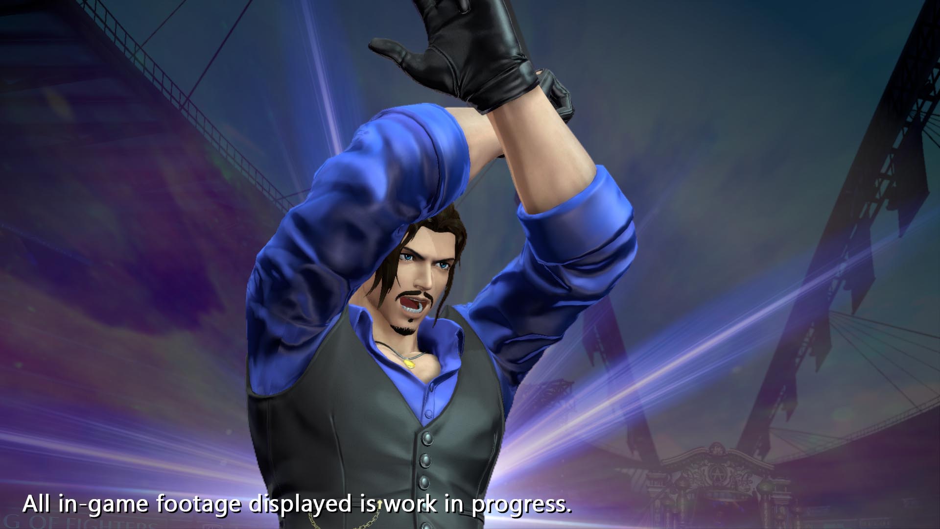
I get what you are are explaining, and what they worked so hard on trying to do, I'm just noting it didn't really work out. Not all experiments are a success. The sprites in XIII were indeed gorgeously animated, HOWEVER we got stuff like
I know its supposed to just be that her head is tilted down, but the way its designed just makes it look like her face is centered at the bottom of her head rather than the center, making her forehead look abnormally large. To me, that looks awful.
Again, the face. It looks like her entire face is scrunched up down by the chin. Also less extremely, I miss when her old sprite would have the ponytail sway lol
Actually that's another problem the xii sprites had. The hair looked bad. Likely due to the 3d model base, the hair looked like a single solid chunk. Like look at Leona here. In her old sprite the hair was long and strands swayed as she moved. In xiii its just a short solid piece that stays static on top of her head. In the old sprites the hair was much more dynamic.
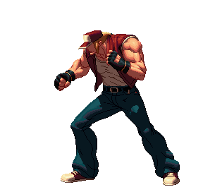
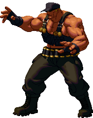
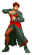
Then there's the issue if Ralf and Clark
I get that they were TRYING to go for super muscular physiques for strong guys, but its too disproportionate as well as too drastic a change so it winds up looking downright freakish. He doesn't look so much muscular, as he does look like he's covered in cancerous growths/tumors.
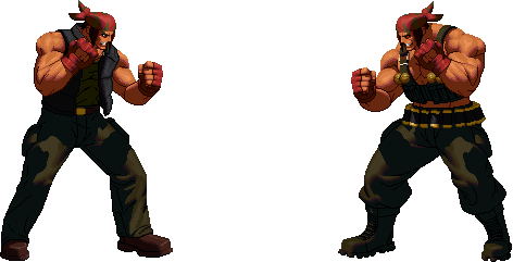
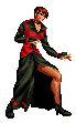
Someone edited Ralfs sprite to better resemble his classic design (on the left) and I feel like it looks far better than the actual xii sprite (on the right)
Its a similar situation to Sonic Boom Knuckles.
On paper I get that the idea was "strong guy needs to be big", but in practice it looks downright silly, due to the drastic change in proportions. Especially bad in his case because now the focus is on his torso rather than his fists, which goes against the entire concept of a character named KNUCKLES. Now he's too large for his own character design. Too big for his dreads to allow him to glide, and he loses the iconic boxing appearance.
Its like the difference between
and
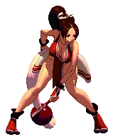
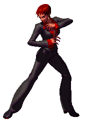
Then there's my favorite lady, Vice, who had a combination of problems with her design.
For starters, she lost all of her bulk/muscle mass, which worked fine for Mature, but not for the premier female grappler of kof.
Compared to her classic and cvsnk sprites
She looks much much thinner, which doesn't really fit her character. Then there's also getting in to
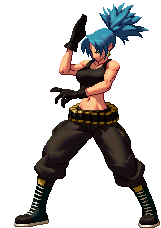
The face has the usual problem of being situated too far down on the head but its not as noticeable for her due to the hairstyle not showing as much forehead. But the HAIR however was changed more than you'd think and it changes her entire appearance. Originally it was kind of a messy boy cut, with visible sideburns and hanging forward a bit, giving her a "wild" feeling. However the redesign trimmed it even shorter, almost making her look bald with hair simply painted on, by comparison. And the change does NOT flatter her. Plus before she had dark brown hair with light skin, whereas now she has bright red hair with dark skin. Combined with the costume change, her general color scheme is off. Now her hair matches the trim rather than the base as before. Also in a rare departure from my usual tastes, I actually prefer her dress over her suit.
On the new models, not only do they look exactly like, or worse than, certain PS2 models (seriously i can keep making image comparisons), but as others have stated, it could be easily fixed by a stylized filter. Like I feel like if they did the xiii method of making sprites from the models, but used these much better proportioned new models, it would have looked fantastic. As is, its the Wind Waker HD problem where, without the actual lighting and filters, the base models look incredibly bland.
Tyaren don't stop discussing stuff. I have nothing but respect for you and learn a lot from your posts, but I feel like you focus exclusively on the technical side of design sometimes, and forget that art is subjective. I get the impression you look at things solely as an artist and designer, but forget that's not the same way an audience/consumer sees things. Do you remember your Eliot contest entry? I remember you noting how it looks great at face value, but you mirrored the image whichade it look odd from the different perspective. Think of it like that. You're seeing the XIII sprites as intended and designed, while I'm seeing the flaws in the design and proportions.
But please don't stop discussing, by any means.