The Art Style and Graphics Discussion

Jadeinchains

Well-Known Member
Not yet at least sadly. They say that there's more online features coming so maybe that will be a thing in the future. It would be great If they added something like that cause I'd definitely post more screenshots if they did!
 

Tyaren

Well-Known Member
Standard Donor
DFRZuZdUQAAP-Hm.jpg:large

Seeing footage/screens of BotW, I am always torn. On one hand I realize that a lot of care went into the visuals and they do convey a great sense of atmosphere. As usual, Nintendo created a cohesive design, in this case a style close to a Ghibli movie, with lots of love for detail and that on an immense open world scale...on the other hand the already dated hardware of the Switch, being hampered even more by the tablet function, makes the game look pretty rough and unappealing at times. :/

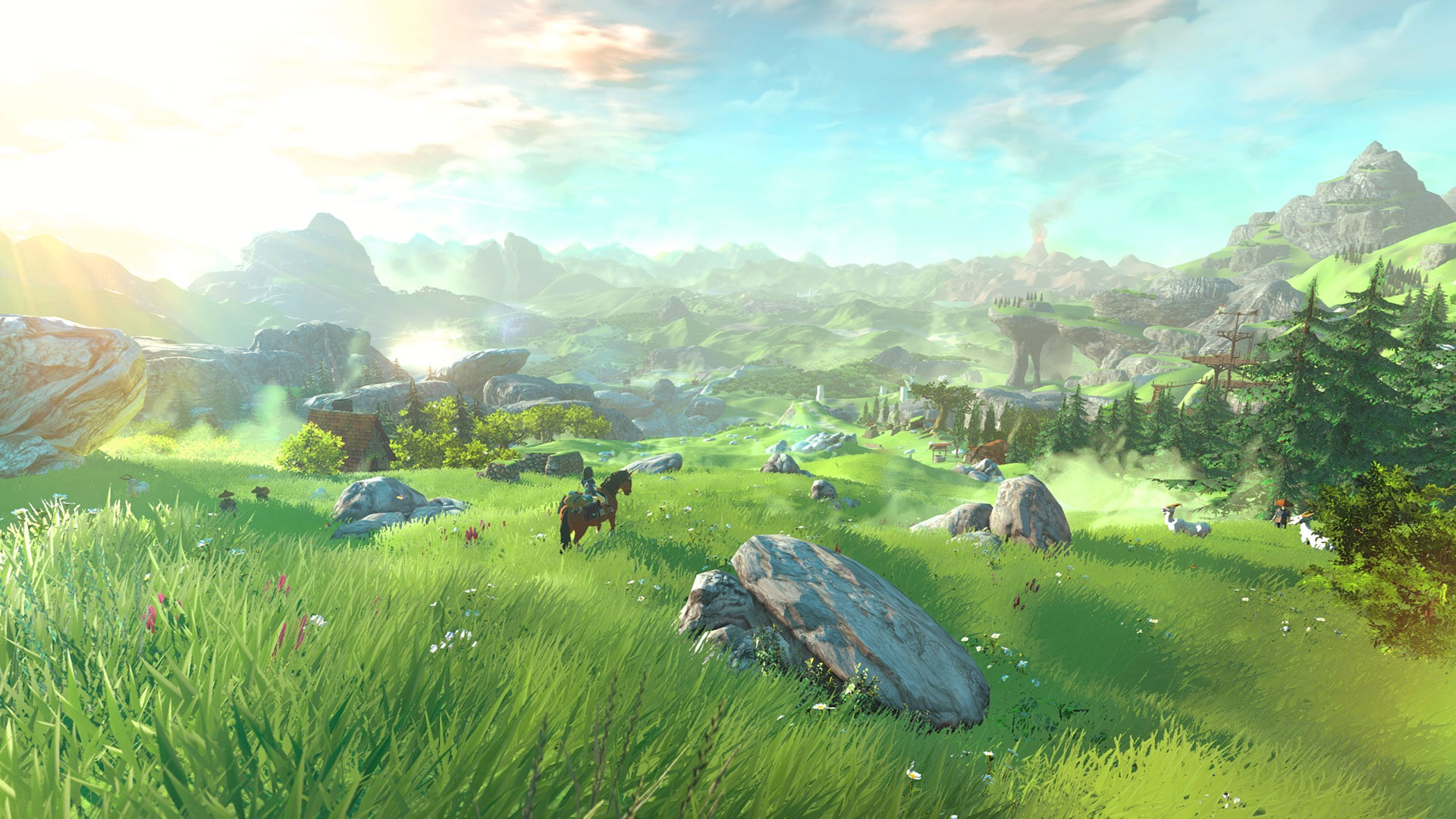
We all do remember the very first screenshot of the game, right?

The-Legend-of-Zelda-Twilight-Princess-HD-1080-Wallpaper-2.jpg


The density of objects, grass and foliage and this immense range of view would even challenge the PS4 though.
Here's a couple of screens of BotW running on an Emulator for PC, showing how the current game would improve if they at least could bump the resolution to full HD:

Cemu2017-03-1119-18-35-15.png


Cemu2017-03-1119-23-46-44.png


nintendo-swith-emulator-the-legend-of-zelda-breath-of-the-wild-on-pc.jpg


Already looks a lot better, right? Even closer to an anime. It's also doing wonders for details such as the crosshatching on characters and textures and texture filtering. You could hardly even make out little details like this before.

Still, I am looking forward to more of your pics @Jadeinchains, alright? Zelda remains one of my favorite game series and it pains me to not be able to play it right now. :(
( I would've even bought it and a WiiU in the meantime, but that version looks even rougher, has serious framerate issues and Nintendo made the WiiU artificially scarce by recalling all consoles from retail shelves and storage, thus raising its price at the same time. Greedy jerks! :/)
 
Last edited:

Jadeinchains

Well-Known Member
Maybe try to get a switch when it's cheaper or on sale? I don't know it's up to you, And yes in motion the game looks like a studio ghibli movie. It's really pretty. And honestly I play the game in TV mode with a pro controller so it's just like playing any other game. Seriously though botw is amazing. I'd say for any switch owner it's must buy level.
 

Brute

Well-Known Member
Standard Donor
Everything in BOTW looks very washed and undetailed, and not in an impressively artistic way. I honestly never understood why it's visuals don't bother it's absurdly large playerbase. I have literally never seen a single impressive screen from it.
 

Jadeinchains

Well-Known Member
I have literally never seen a single impressive screen from it... until I saw @Jadeinchains masterfully taken photo that took him 5 seconds and randomly took it in the middle of a town, the hud on display and the weather being abysmal. That screen truly blew me away.

Oh lol You must have got cut off in your original comment. This is how you were gonna finish that comment I'm sure...right?...No?

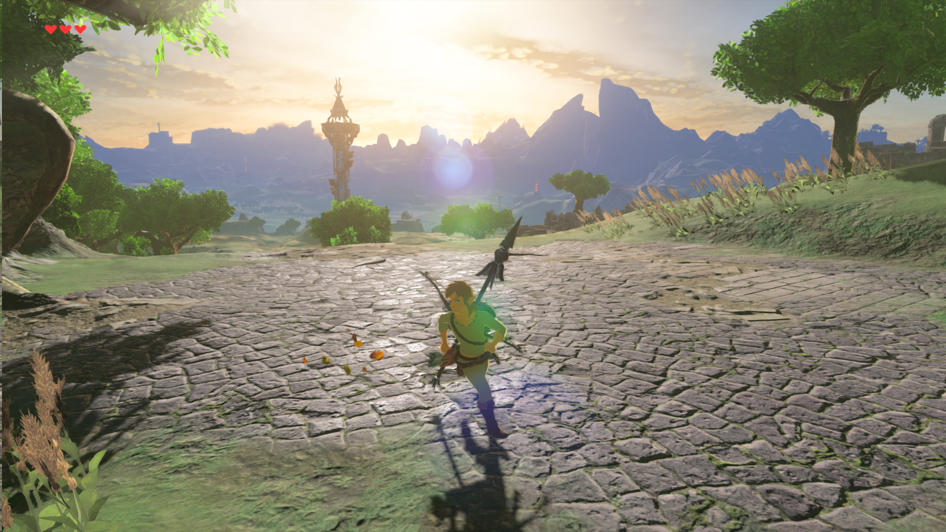
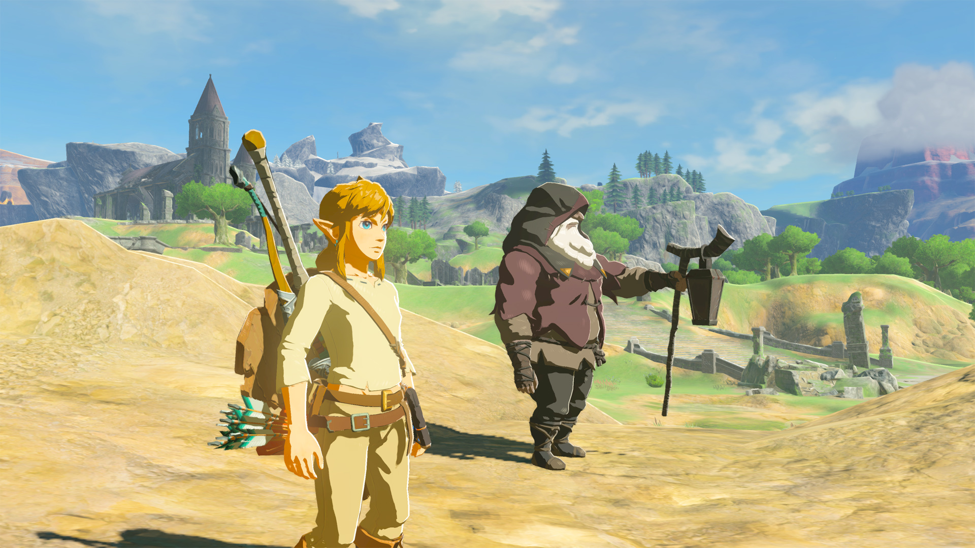
But really I understand lol. I don't think I made the game look as good as I could have. I just wanted to get a quick shot of the classic outfit. In motion it really does look beautiful. I feel like they were going for a drawn type style so it's very cel shaded but if you look for it for can see detailed environments. Maybe I'll try to take screens later that show it off better? It depends maybe the game's artstyle just isn't your thing in general?

Also really does it have a large playerbase? I actually haven't looked into how many people are playing it but I'd guessed it must have been a lot considering it's a new Zelda game and they do well.
 

Brute

Well-Known Member
Standard Donor
It's nothing about your screenshot in particular. I've seen many screens and gameplay footage and the game always looks ugly without fail. The art style is incredibly generic, nothing contains any interesting detail, the colors are washed, and the scaling makes Link and all monsters feel like tiny tokens on a crudely painted board rather than living creatures in an even larger world. Before someone says "It's supposed to look like a painting," -yes, I know. It's just a very ugly painting.
 

Jadeinchains

Well-Known Member
It's nothing about your screenshot in particular. I've seen many screens and gameplay footage and the game always looks ugly without fail. The art style is incredibly generic, nothing contains any interesting detail, the colors are washed, and the scaling makes Link and all monsters feel like tiny tokens on a crudely painted board rather than living creatures in an even larger world. Before someone says "It's supposed to look like a painting," -yes, I know. It's just a very ugly painting.

Lol! I obviously don't agree but I have to admit this was funny! XP
I had a feeling it was probably more you had a problem with the artstyle in general. Still since It is the artstyle thread I'll try to get some better screens of the game!
 

Argentus

Well-Known Member
Everything in BOTW looks very washed and undetailed, and not in an impressively artistic way. I honestly never understood why it's visuals don't bother it's absurdly large playerbase. I have literally never seen a single impressive screen from it.

Still better than Skyward Sword, where they were TRYING to go for a pastel painting look, but in practice, everything was just out of focus and it constantly looked like I was trying to run a ps1 game on a 4k tv, with everything being super pixely and blurry.
 

Tyaren

Well-Known Member
Standard Donor
I have to disagree with Brute too. I guess you could call BotW's visual style generic if you think Studio Ghibli films look generic. I know many people would actually say they are, because these films do share a common style (as do most Disney films and Pixar films).
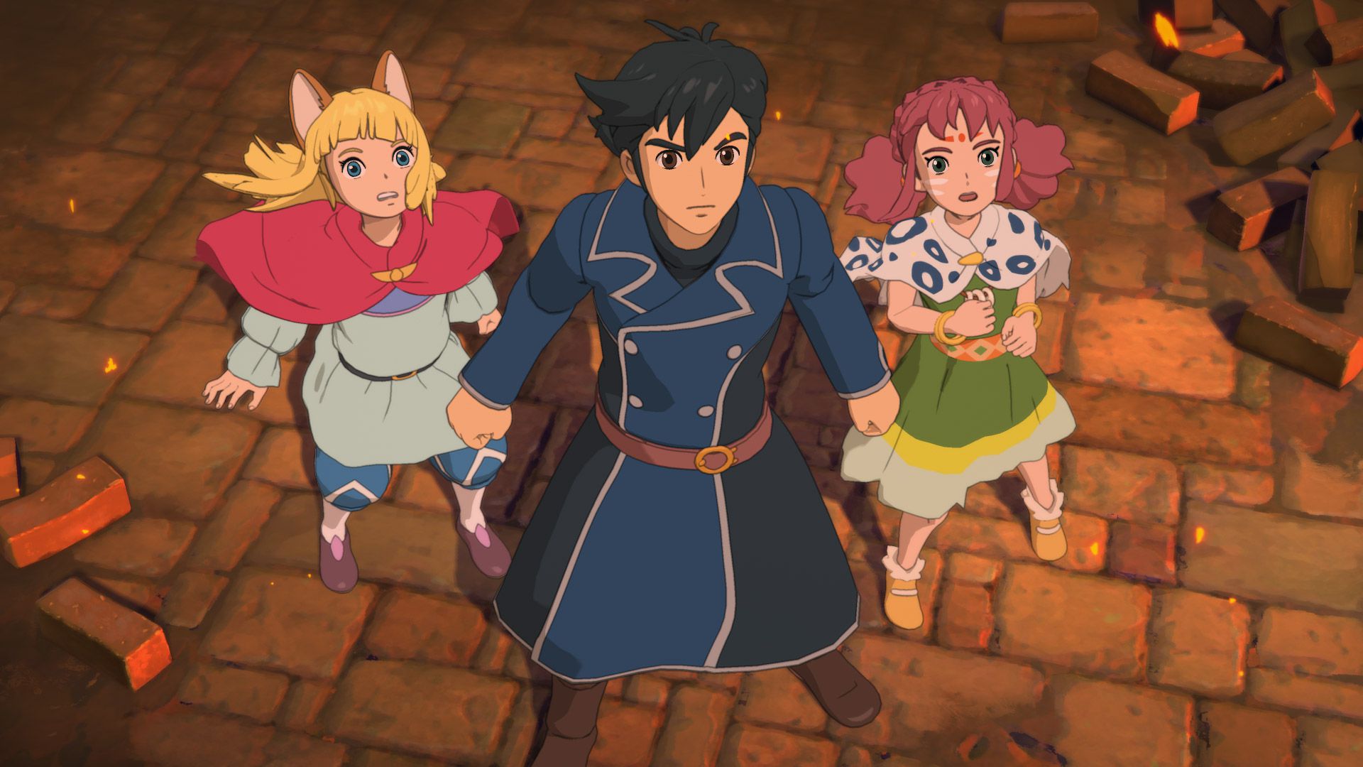
For games there is also the Ni no Kuni series, which is literally designed by Studio Ghibli.

NNKII_Screen_036.jpg


ni-no-kuni-ii-ps4-screen06-us-05dec15


23469918581_ef2bef8d76_o.jpg


ninokuni_07.jpg


But if this style indeed has become generic...then maybe we have to overthink if generic really is a bad thing in any case...?

Now, Nino Kuni does have a lot more attention to detail and thus looks imo better than BotW, for the single reason that it is not a vast open world game, like BotW, where they had to make concessions in multiple ways. The most obvious ones being:
1) With a free camera you can't frame every shot to be Ghibli film perfect. Players like @Jadeinchains will mess up its look, by being handed over the power of the director of photography. XD
giphy.gif

2) The other problem is the oudated hardware of the Switch. They had to scale down detail in geometry and texture as well as scaling detail down due to the poor image resolution, which is something like 800p docked and 720p on the tablet and the WiiU.
But even BotW has moments where its game visuals do shine through all of that and I think the very first trailer shows how the game would look like, if hardware and a free camera wasn't limiting Nintendo's designers'/artists' vision:


Regarding the washed out thing that comes up again and again, lol.They choose to use that look/effect for two reasons:
1) to create depth of field in a vast environment that actually isn't that vast. It's an optical illusion to simulate a look like this:

sommer-natur-huegel-berge-dunst-baeumen.jpg


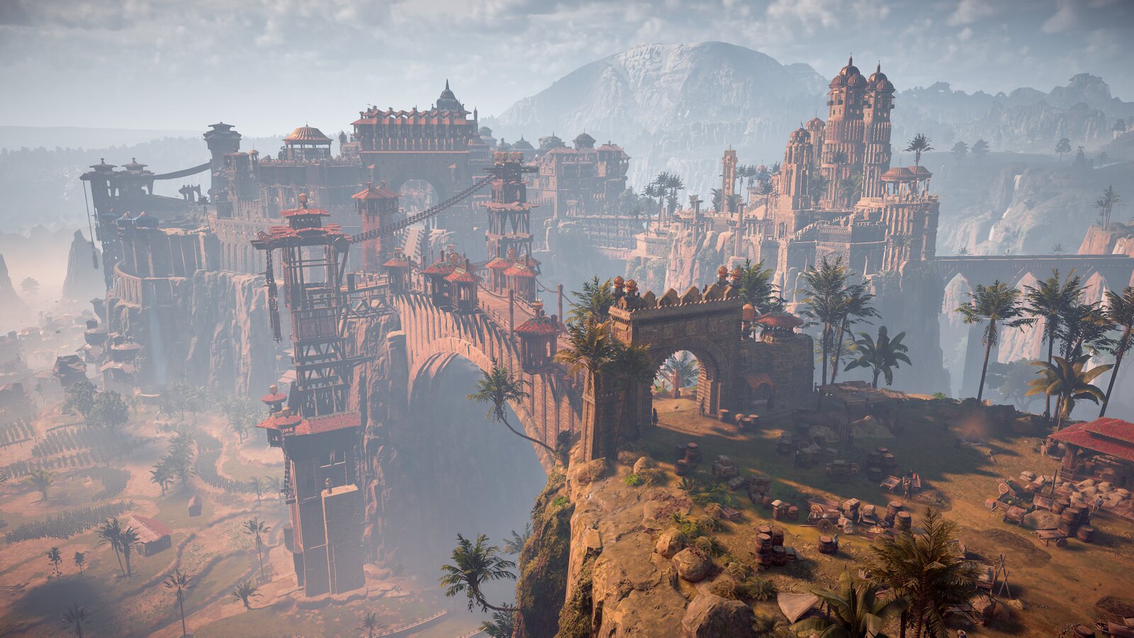
2) It is to hide poor detail and geometry in the distance. As much as I adore Horizon Zero Dawn, it is one of the games that really is tricksing a lot to make the difference of the beautifully detailed foreground to low detail background less obvious and jarring. In some cases, like the huge city of Meridian plus a wide view of surrounding countryside, they have to turn the mist up to eleven.

35684647380_dfe7422ab1_h.jpg


When I first reached that region I actually thought a bug was going on. XD I posted to Neogaf that something was wrong. That there is always fog in the city. Nah, it is just a necessity to hide shortcomings of consoles. (Even PCs would go down to their knees rendering a environment like that.)
Fortunately the foggy city does still somehow make sense, since it is the so called City of the Sun, lying exactly on the border of wetlands transitioning to a desert, mist is perfectly natural in an environment like that, especially when the sun stands in its zenith. When the sun sets the mist disappears. Also lucky, because then the darkness hides low detail backgrounds. ;)
 
Last edited:

Brute

Well-Known Member
Standard Donor
I'm not particularly fond of Studio Ghibli works (though that's primarily a result of their storytelling rather than art style), but I wouldn't at all say that Zelda BotW's visuals are comparable to SG's. The screens you provided from Ni no Kuni are colorful, detailed, imaginative, and have lighting that actually reflects the tones employed in 2D animation. Zelda possesses none of those qualities. If Zelda is trying to look like a SG film, it is failing miserably.
 

Tyaren

Well-Known Member
Standard Donor
Well, I tried to explain why they have to "wash out" vast open world games like this as well as toning down detail...
 

Brute

Well-Known Member
Standard Donor
Yes, but that doesn't make it look any better. If a game had to rely on sprites made with MS paint due to budgetary reasons and the end product was ugly as a result, then it's still ugly, regardless what processes were involved in its creation. I'm not going to forgive bad visuals because Ninetendo makes crappy hardware, or because they chose to make an open-world game with tech that can't support it properly. Serious Sam 1 looks better than BotW. That was made with tech in 2001, but they still managed to make something that didn't look like a bleached asshole. Nintendo didn't.
 

Jadeinchains

Well-Known Member
Me - "Oh Tyaren posted... Wait what?!"

Players like @Jadeinchains will mess up its look, by being handed over the power of the director of photography. XD
giphy.gif

...prison honey.

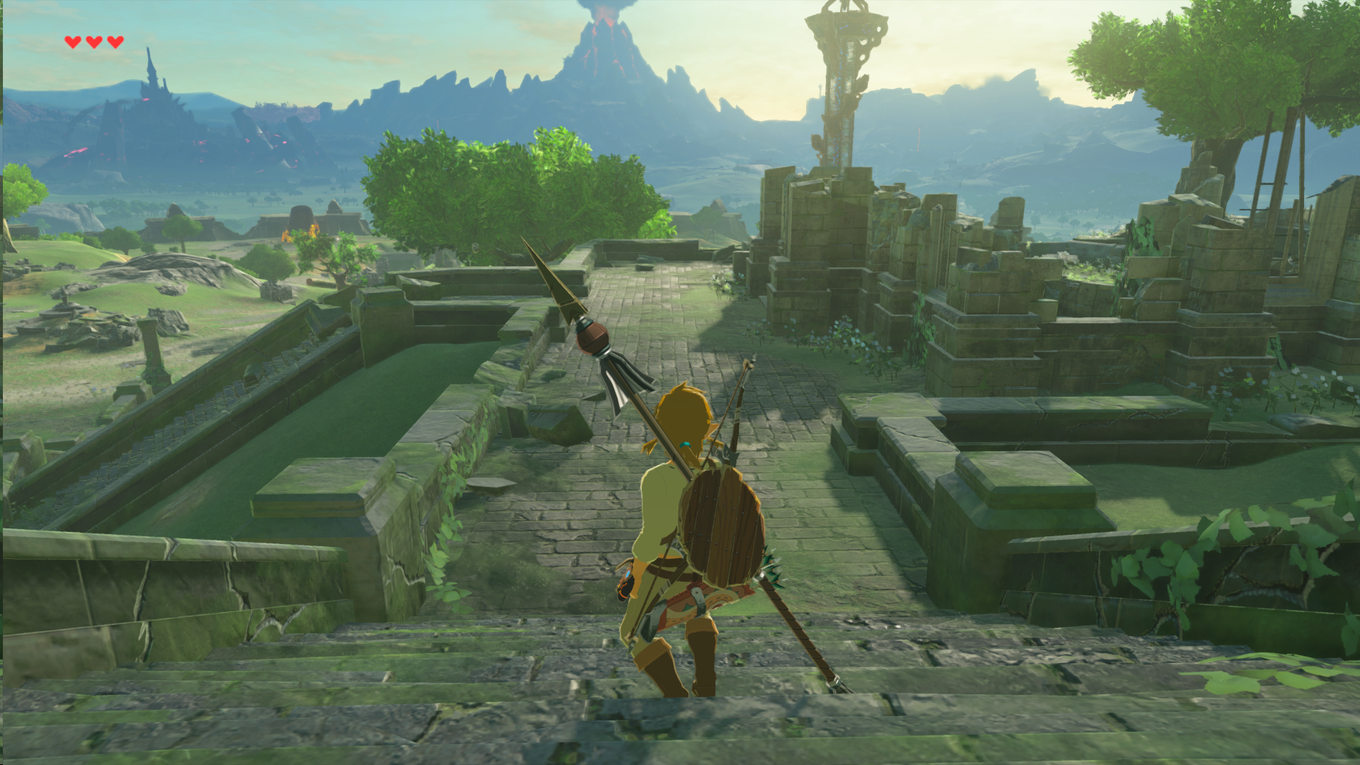
I didn't invent photography with the botw screenshot for this kind of slander. I'll remind you all I took these -

C7PiTLpX0AEgZ-f.jpg


C7PiJOaXwAA3SeY.jpg


C7PiCbdXkAEF8ay.jpg

There's no photography mode in botw and that on top of the hud always being there doesn't really lend itself that well for taking screens so lol there wasn't much I could do. :p

And Brute...you don't like studio ghibli's story telling?! Sacrilege.
 

Tyaren

Well-Known Member
Standard Donor
Me - "Oh Tyaren posted... Wait what?!"


...prison honey.

I didn't invent photography with the botw screenshot for this kind of slander. I'll remind you all I took these -

C7PiTLpX0AEgZ-f.jpg


C7PiJOaXwAA3SeY.jpg


C7PiCbdXkAEF8ay.jpg

Aww...too bad I can't really make out anything on these screens because they are so small and compressed. :/

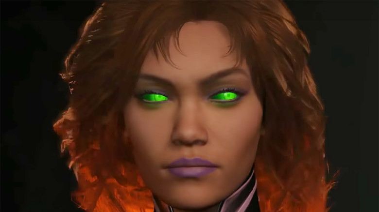
On another note: A Starfire trailer dropped for Injustice 2 and I think Starfire looks hot:


She's modelled and animated really well. Who'da thunk NetherRealm would ever be able to create an attractive female character like this? I also really like how they realized her burning hair (it could flop a bit less weirdly around though).

Also, doesn't she totally look like J.Lo?

Injustice-2-Starfire-780x438.jpg
 
Last edited:

Jadeinchains

Well-Known Member
Aww...too bad I can't really make out anything on these screens because they are so small and compressed. :/

On another note: A Starfire trailer dropped for Injustice 2 and I think Starfire looks hot:


She's modelled and animated really well. Who'da thunk NetherRealm would ever be able to create an attractive female character like this? I also really like how they realized her burning hair (it could flop a bit less weirdly around though).

Also, doesn't she totally look like J.Lo?

Injustice-2-Starfire-780x438.jpg

Really? They look big on my screen... Anyway stop shading me. :p And yeah Starfire looks cool. She does kinda look like J.Lo... And lol yeah they've managed to do well with the female faces in Injustice 2.
 

Argentus

Well-Known Member
I'm not particularly fond of Studio Ghibli works (though that's primarily a result of their storytelling rather than art style), but I wouldn't at all say that Zelda BotW's visuals are comparable to SG's. The screens you provided from Ni no Kuni are colorful, detailed, imaginative, and have lighting that actually reflects the tones employed in 2D animation. Zelda possesses none of those qualities. If Zelda is trying to look like a SG film, it is failing miserably.

This, i was about to say the same thing.

The actual Ghibli made game looks leagues better than BOTW.

the Ghibli game just "pops" a lot more, its much more vibrant.
Aww...too bad I can't really make out anything on these screens because they are so small and compressed. :/

On another note: A Starfire trailer dropped for Injustice 2 and I think Starfire looks hot:


She's modelled and animated really well. Who'da thunk NetherRealm would ever be able to create an attractive female character like this? I also really like how they realized her burning hair (it could flop a bit less weirdly around though).

Also, doesn't she totally look like J.Lo?

Injustice-2-Starfire-780x438.jpg

okay i'm sorry, the level of graphics are impressive, especially that hair, but I really don't like how the characters in Injustice just do not look like the comic characters they are supposed to be, design wise. Like yeah, that doesn't look like Starfire AT ALL, even if you take into account how she's been drawn differently by various artists over the years.

Also i really can't see Kory as the type to wear lipstick. That seems kind contradictory to the whole "nudity isn't a taboo" that makeup would somehow be a normal thing when CLOTHES are not. Can't even compare it to tribal markings on actual nude tribal people or anything. It's LIPSTICK.
 

Tyaren

Well-Known Member
Standard Donor
okay i'm sorry, the level of graphics are impressive, especially that hair, but I really don't like how the characters in Injustice just do not look like the comic characters they are supposed to be, design wise. Like yeah, that doesn't look like Starfire AT ALL, even if you take into account how she's been drawn differently by various artists over the years.

Also i really can't see Kory as the type to wear lipstick. That seems kind contradictory to the whole "nudity isn't a taboo" that makeup would somehow be a normal thing when CLOTHES are not. Can't even compare it to tribal markings on actual nude tribal people or anything. It's LIPSTICK.

I don't know anything about Starfire, so I wouldn't know how she is supposed to look like. The default costume in Injustice 2 is only just the base though, you will be able to customize her look to your liking with lots of different gear pieces. Among those are usually also pieces a character wore in another comic or animation.

With the lipstick thing I couldn't really follow, lol. What is that about nudity and tribal markings?
 

Argentus

Well-Known Member
I don't know anything about Starfire, so I wouldn't know how she is supposed to look like. The default costume in Injustice 2 is only just the base though, you will be able to customize her look to your liking with lots of different gear pieces. Among those are usually also pieces a character wore in another comic or animation.

With the lipstick thing I couldn't really follow, lol. What is that about nudity and tribal markings?

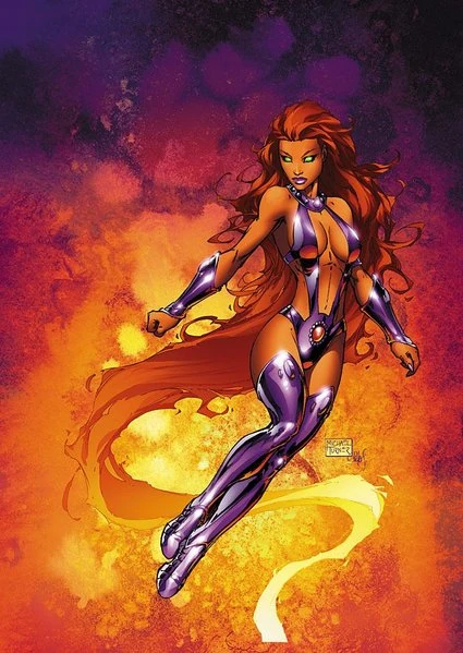
Long story short, a big part of Starfire is her culture totally lacking modesty or shame. Regularly goes around nude, kisses freely, etc. Not in a slutty way, but in an "all natural" way. That's why her classic costume was basically a slingshot bikini. Or at least the justification for it lol. So lipstick on a character like THAT feels really odd.

But as for Injustice, i'm mostly talking about the faces. Like Black Canary looks more like an average housewife than a comic book superhero. In Starfire's case, she normally has a much....how do I put this...Longer face?

latest


Though in google image searching her, I am noticing her often drawn with bright red lips, guess i always chalked that up to artistic style rather than actual lipstick, and the purple lipstick IS a recent thing in the comics as well, so I guess I'm just off about that. I kinda dropped recent comics because they all, well, suck.

Still seems out of character though lol.

But back on injustice, the faces are just too...I dunno, plain jane? women's faces are usually too wide, and then we have nonsense like Joker's teen boy design, etc.

It winds up reminding me of when feminists would try to redesign superheros, who keep in mind, are olympic level athletes, as being fat because that's "more realistic".
 

Brute

Well-Known Member
Standard Donor
There's very little consistency in the sculpt of Satarfire's face over the years between various comic artists. The most consistent features are the generic qualities that pretty much every female character has (high cheekbones, big lips, small nose). I'm not particualrly bothered by the fact that NR tried to give their characters actual faces, just as I wasn't bothered by DOA5 assigning actual faces in place of interchangeable anime shit.

Really? They look big on my screen...
Well, they are less than 720p.
 

Jadeinchains

Well-Known Member
Hmm? I took them off of twitter so I'm guessing that was probably why the images are small. Oops lol. They appear big on my screen but I guess not.

And I actually think they did a good job with Star fire. I feel like she's very recognizably star fire anyway. Also is her hair always on fire? If so it must get annoying when she's just trying to relax. Also tbh I think it would be cool if Teen Titan Star fire was an option lol.
 
ALL DOA6 DOA5 DOA4 DOA3 DOA2U DOAD
Top