DOA5 Character Wallpapers

werewolfgold

Well-Known Member
So..., I got bored yesterday. And, I was like, "I don't really have any DOA5 wallpapers. I should do something about that."

So, my boredom = everyone else's gain, I suppose. I tried to grab as many action shots as I could. But, sometimes, the screens available didn't work out to my advantage. I'm on vacation at the moment so if people have suggestions for changes, I may be able to accommodate for the next week.

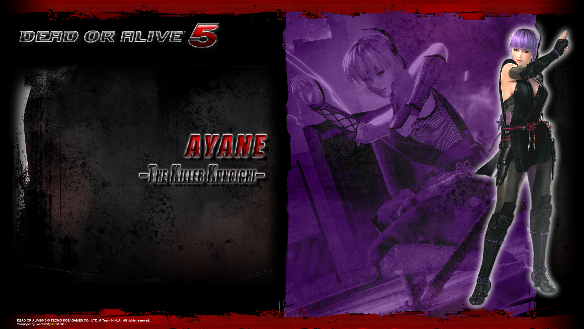
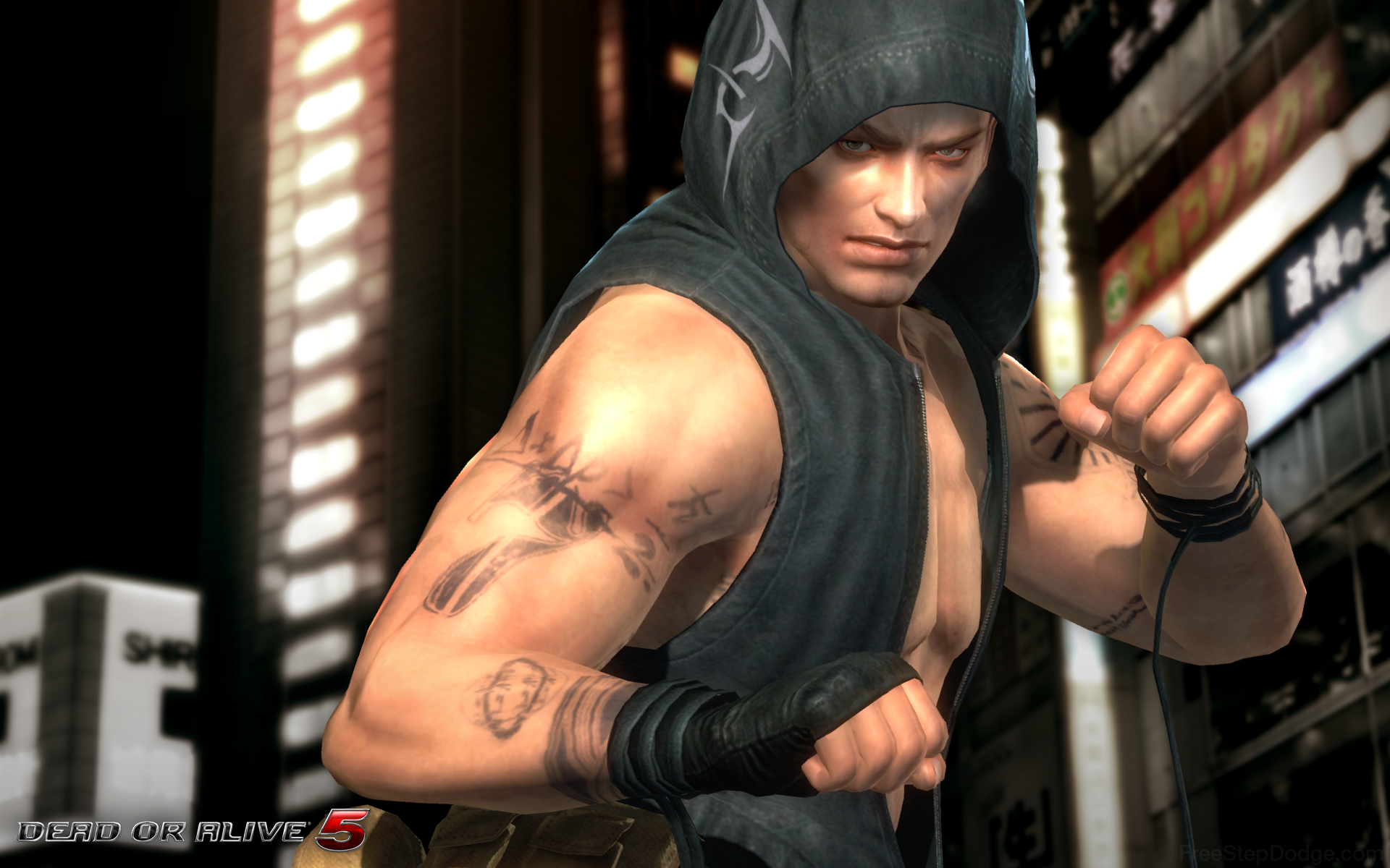
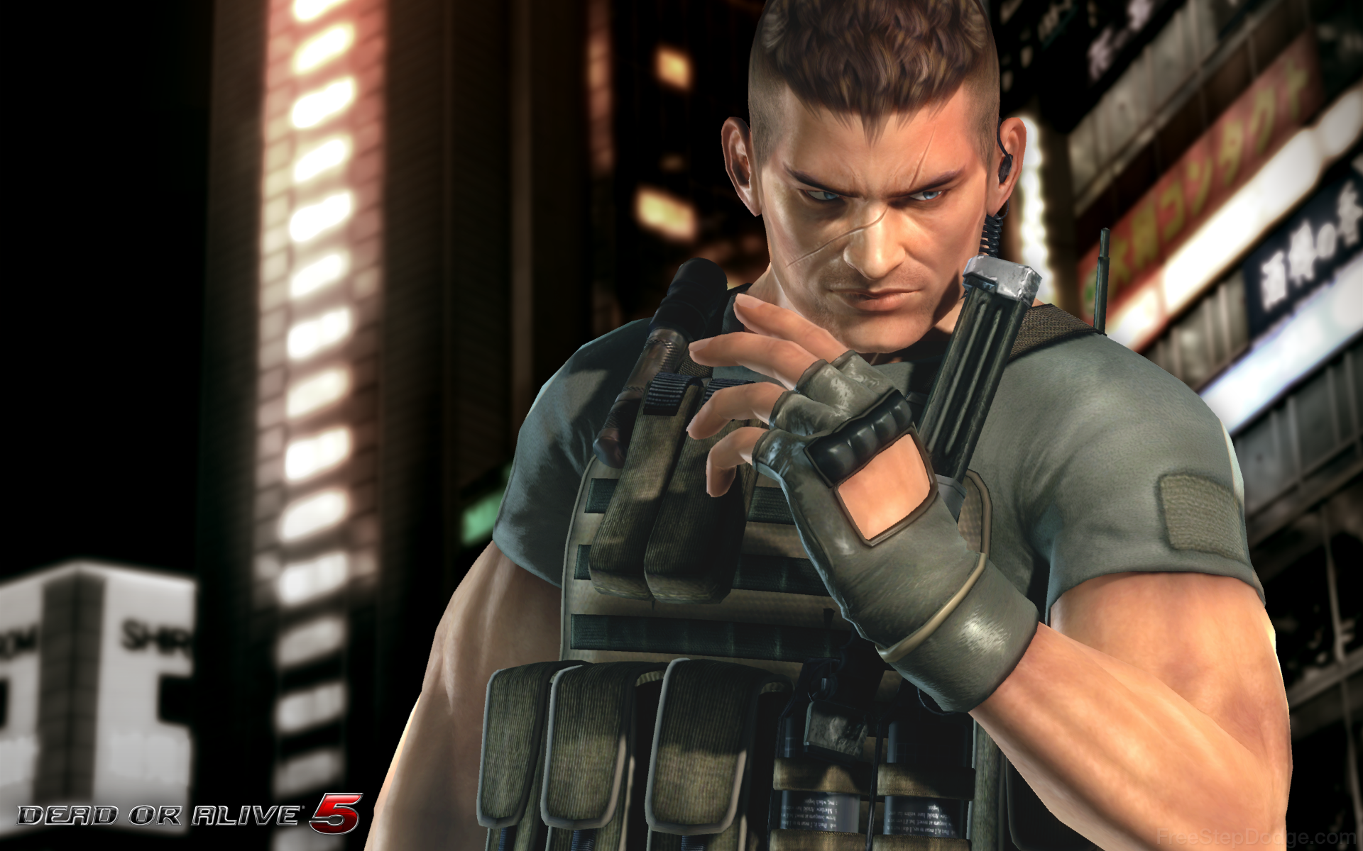
1920x1080 resolution. I'll update it with the other characters as their artwork is revealed. Enjoy.

http://werewolfgold.deviantart.com/gallery/39091782

Edit #2: Likely the final update. All 24 characters + 3 alternates added.

If you've swiped some before of my wallpapers before, I've made a few adjustments.

*I changed the hyphens on the end into dashes. Mainly for OCD reasons since some of the nicknames have hyphens as well.
*Some of the backgrounds for some characters were brighter than others by accident. I think Lisa's, Brad's, Gen-Fu's, and Pai's. They've been fixed now.
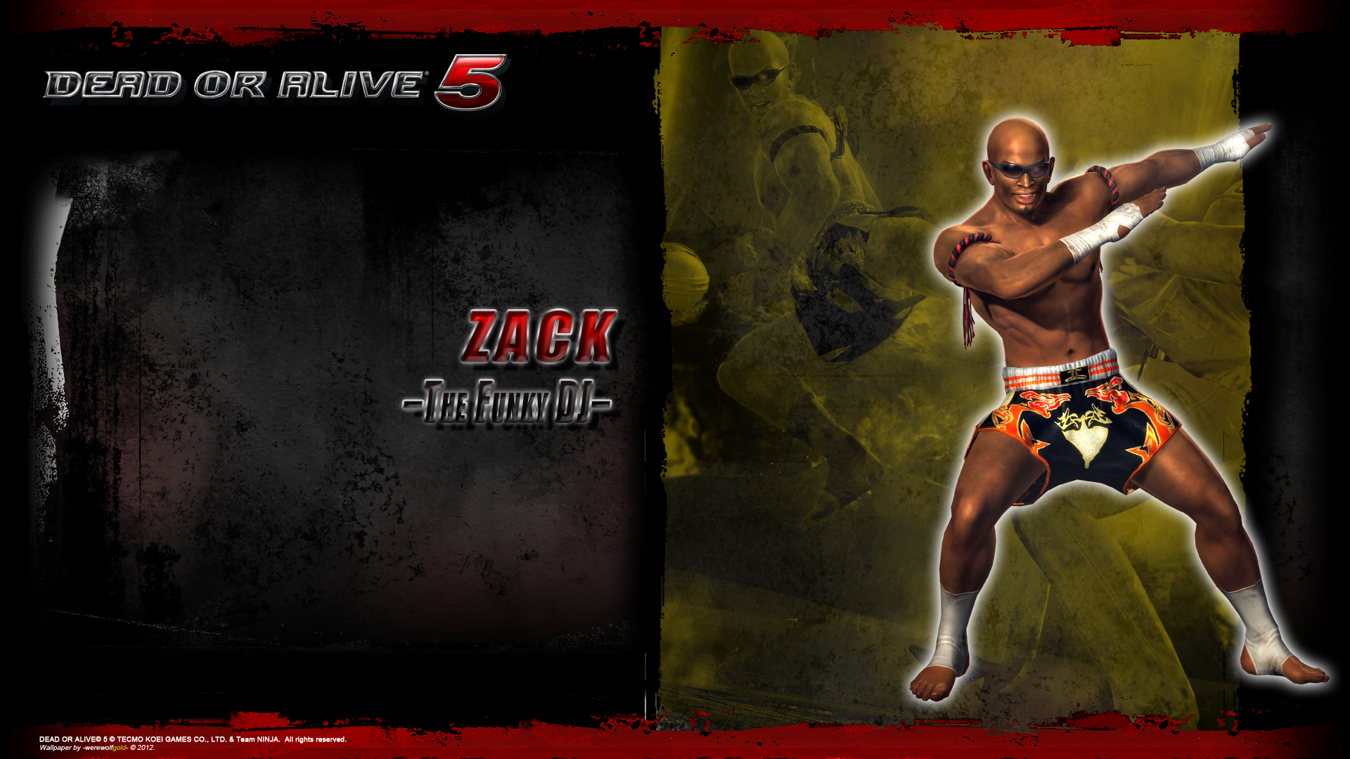
*Alternates for Zack and Mila have been added.
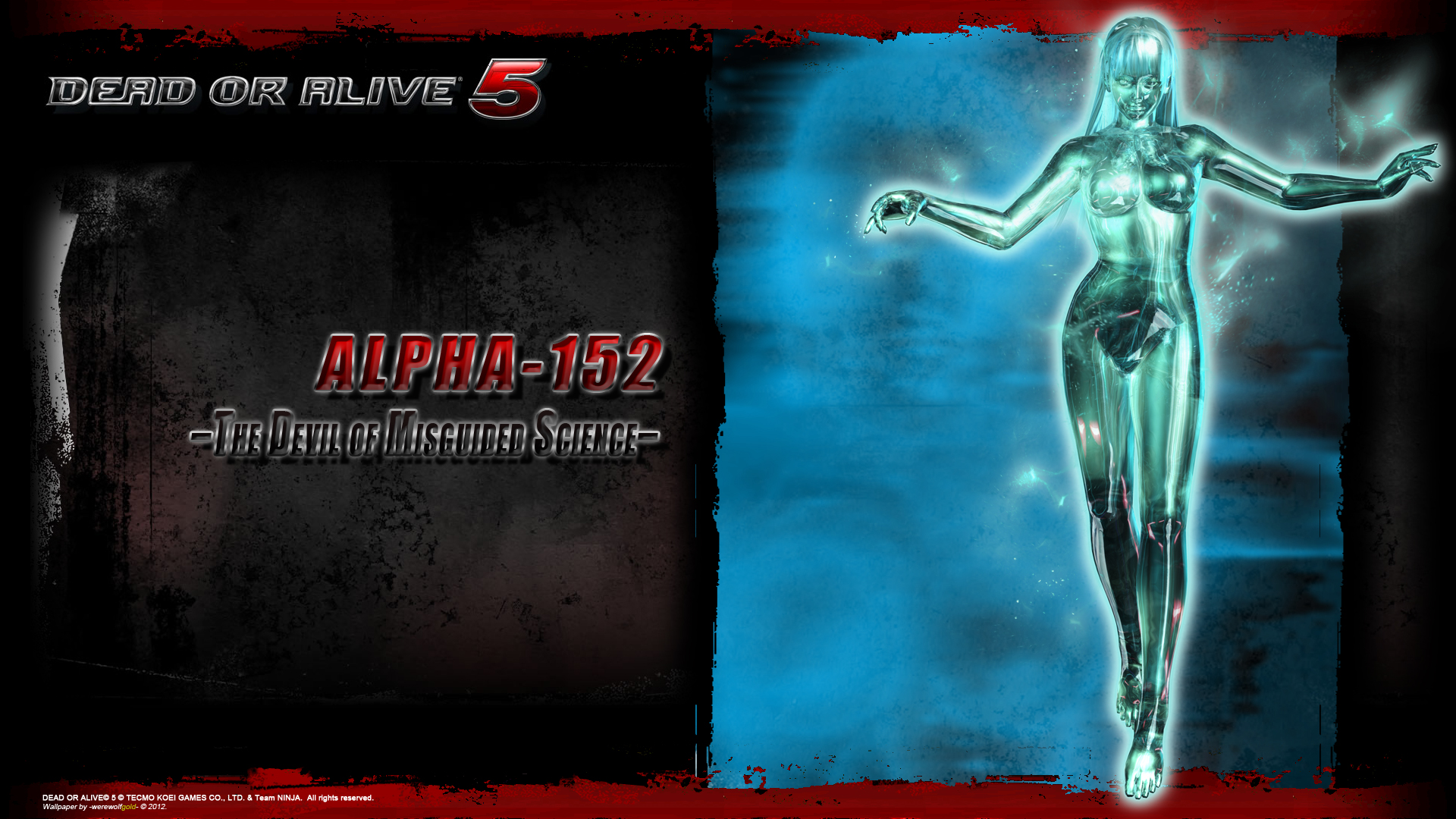
*Alpha has been added.
*A full character roster wallpaper has been added.

1920x1080. If you have any issues with them, be sure to let me know. Special thanks to this site for uploading character renders.
doa5_ayane_wallpaper_by_werewolfgold-d5ccynj.jpg

doa5_alpha_152_wallpaper_by_werewolfgold-d5kqn12.jpg

doa5_zack_wallpaper_by_werewolfgold-d5cd7vu.jpg

doa5_character_compilation_wallpaper_by_werewolfgold-d5kr7y5.jpg
 

Kronin

Well-Known Member
Mate you are awesome... thanks so much for your efforts and the beautiful wallpapers! ;)
 

werewolfgold

Well-Known Member
Those are ugly.
I suppose you're free to think that. But, I would say that the ones you posted are little more than the character art over the city background.

I tried to incorporate the color scheme and designs used on the main site, which do have a gritty appearance that may not be to everyone's liking.

But, if you have actual suggestions on how you would improve them beyond "those are ugly", I may be able to take it into consideration either now or if I make more wallpapers in the future...
 

grap3fruitman

Well-Known Member
Standard Donor
Yeah, mine aren't exactly great but they're more minimalist and classy. Yours are also just character art thrown with the default outer glow over a screenshot with an a way too powerful color blending mode and poorly kerned text with terrible use of the bevel and emboss feature.
 

PhoenixVFIRE

Well-Known Member
Yeah, mine aren't exactly great but they're more minimalist and classy. Yours are also just character art thrown with the default outer glow over a screenshot with an a way too powerful color blending mode and poorly kerned text with terrible use of the bevel and emboss feature.
and to think, I thought they looked pretty good. I guess it's because I know nothing about photoshop or making pictures/wallpapers/etc. lol so I don't have the keen eye to notice anything wrong. I think to the average person who knows nothing about this stuff(like me), they look pretty good. Actually, it'd probably fool me into thinking it was something legit :/
 

Doug Nguyen

Well-Known Member
Yeah, mine aren't exactly great but they're more minimalist and classy. Yours are also just character art thrown with the default outer glow over a screenshot with an a way too powerful color blending mode and poorly kerned text with terrible use of the bevel and emboss feature.
Can you post the link to yours grape?
 

werewolfgold

Well-Known Member
Can you post the link to yours grape?
They are linked within his post. Look in the lettering.

Yeah, mine aren't exactly great but they're more minimalist and classy. Yours are also just character art thrown with the default outer glow over a screenshot with an a way too powerful color blending mode and poorly kerned text with terrible use of the bevel and emboss feature.
"Minimalist" and "classy (as you so call it)" isn't for everyone. Mine were a lot more subdued until I got the suggestion that they needed more color. The color is used to separate the characters apart. Otherwise, it just looks samey across the board. And this is also to prevent the background just being a straight screenshot filled with color that would detract from the character super imposed on top of it.

Poorly kerned text? I find it hard to believe that anyone would have trouble reading it. Terrible use of the bevel and emboss? Would you prefer flat-colored text that doesn't fit? I was referencing the logo when I decided to put a gradient over and emboss the text a little. As well as when I put the white outline over the characters and the name/nickname text. I also had to make design choices in terms of background placement and composition, even though I was using assets for the main site and not painting or sketching something. I wanted it to look like something that would be in line with the game's design. I don't think minimalist and classy is what the game is about.

But, I could see why you (a photographer from what I can gather) made yours the way you did while I (a digital painter) made mine the way I did.

and to think, I thought they looked pretty good. I guess it's because I know nothing about photoshop or making pictures/wallpapers/etc. lol so I don't have the keen eye to notice anything wrong. I think to the average person who knows nothing about this stuff(like me), they look pretty good. Actually, it'd probably fool me into thinking it was something legit :/

I think "wrong" is just artist's opinions really. I don't think that things like "way too powerful" and "terrible" can be objectively stated without a lot more reasoning. Some of it will just be forever subjective, actually.

BTW, this is an ACTUAL legit wallpaper that Team Ninja gave out... Yeah... So, you'll have to forgive me for trying to go another direction and push it a little more. lol
29_doasexy04.jpg
 

Matt Ponton

Founder
Staff member
Administrator
Standard Donor
With the exception of the DOA5 logo and rough edge of the white cut off... they look nice.
 

Matt Ponton

Founder
Staff member
Administrator
Standard Donor
What's wrong with the logo? Would you prefer that it not be there?

It's more so the corner of the white and top edge of that white underneath it make it appear like you slapped a DOA5 with black bg logo ontop. Basically it doesn't blend into the image below it.
 

CyberEvil

Master Ninja
Staff member
Administrator
Premium Donor
I didn't see them before but they look pretty good to me. Nice work.
 

Kronin

Well-Known Member
Thanks again for your work, I repeat that for me your wallpapers are really beautiful... when the render of Alpha 152 will be revealed, I hope that you will complete the series adding also her wallpaper :)
 
ALL DOA6 DOA5 DOA4 DOA3 DOA2U DOAD
Top