Graphical Changes

WorldWithoutWords

New Member
Hey guys, The new direction for DOA 5 is awesome but there are some things that bug me (mostly related to Hitomi) so I thought I'd do some quick paintovers of some stuff,etc. and we can talk about the new graphical style of DOA 5.

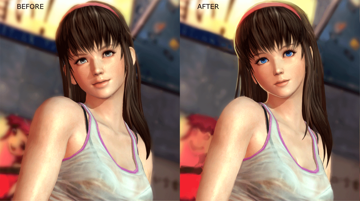
Starting with Hitomi's infamous face. I picked the least flattering image I could find to paint over.
Hitomicomparegif.gif


Things I changed:
-Thinned out the neck and arms, they looked pretty wide to me.
-Made her ears stick out way less, she looked kind of like a monkey..
-Made her nose and mouth smaller with thinner lips.
-Changed her jawline to something less wide and more feminine.
-Gave her more hair to change her head shape, it was a little too thin before.
-Made her eyes more blue, I thought it just looked better and her favourite colour is Sky Blue apparently anyway.
-Minor tweaks here and there.

Higher res comparison:
http://img20.imageshack.us/img20/3179/hitomicompare.png

Overall I tried to bring in some of DOA4's anime style roots into what they're doing now and make her look less like a chimp/little boy but it's only a start, it's not really well done.

What do you guys think should be fixed about the newer graphical style of DOA5?
 

Allan Paris

Well-Known Member
yeah, looking at the after pic she doesn't seem real. I don't believe eyes can get that blue, naturally? Her ears need to be fixed overall, covering them up with hair also makes her look unreal.
 

DriftSlave

Active Member
Look at Ein in DOA3....LOLZ and you start to see it....then the mind fuck will happen...then you'll be like....why did they let that happen?
 

Allan Paris

Well-Known Member
Look at Ein in DOA3....LOLZ and you start to see it....then the mind fuck will happen...then you'll be like....why did they let that happen?

I never really payed any attention to it. I guess if Itagaki had his skinned smoothed out, maybe.
 

virtuaPAI

I am the reason why you are here!!!
Staff member
Administrator
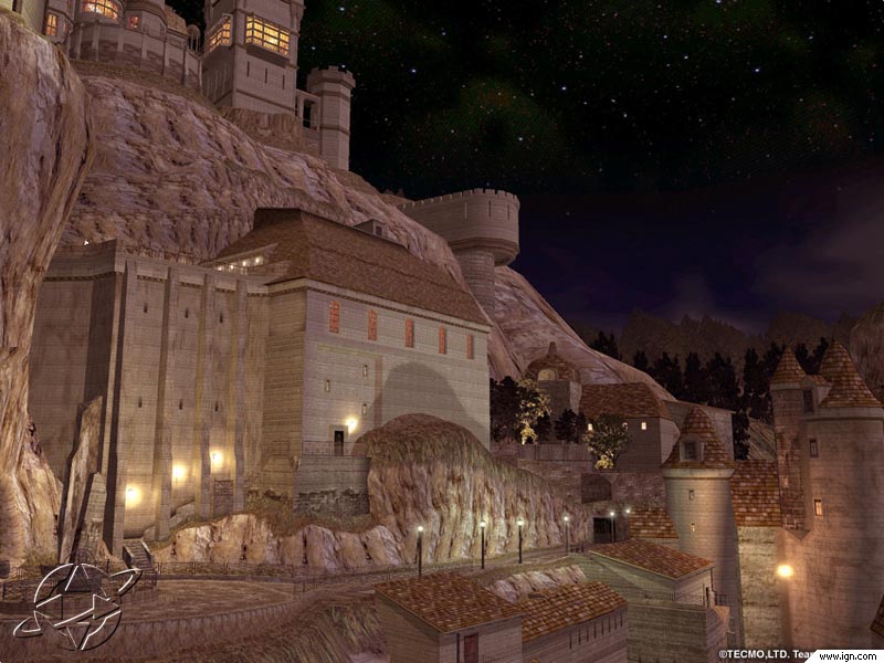
He did look like Itagaki. Sun glasses and trench coat. Speaking of Graphics, The game is on the Dark side. Being Dark is not the problem(Doa3 was dark), but its like an ugly Darkness. It would be nice if they took a more organic approach to the stages. Kinda like:
Deadoralive3_b2_790screen011.jpg

Deadalivethree2.jpg

And they should bring back the Danger Zone.
 

Darrell

Well-Known Member
Great job dude! yeah the eyes are a bit too blue, but yours is much cuter, and she even looks like she could be half Japanese. Great Job dude. I hope they see this can consider it. I for one don't really have a problem with the way Hitomi looks, like most people do. I think she looks awesome in her intro pose.
 

MrMoon360

Well-Known Member
I like the changes that you made to her. She is ugly in her current form. I understand that Team Ninja wanted to go a more realistic route, but Hitomi did not have to take the fall lol.

She looks like an ordinary human being for once. Not a lifeless doll. Nothing wrong with that.
Need to get your eyes checked guys if you think she's ugly.
 

MrMoon360

Well-Known Member
The game is on the Dark side. Being Dark is not the problem(Doa3 was dark), but its like an ugly Darkness. It would be nice if they took a more organic approach to the stages.

I think we're speakin' a little too soon. We've seen two stages.
One is in a cave (1st tier), one is in Shibuya at night....
I think darkness is acceptable in both cases. lol
I don't know what you mean by ugly, really.

Maybe its just realistic, instead of fantasy?
I respect peoples personal preference.

Lorelei was my shit though. I'll give you that.
 

Kasumi

Active Member
I like what you did but is missing something to reach the "realistic" look. I think they nailed Ayane and Kasumi, they look realistic but yet like in the old games, with Hitomi there is something that is not clicking with many people.
 

MrMoon360

Well-Known Member
I like what you did but is missing something to reach the "realistic" look. I think they nailed Ayane and Kasumi, they look realistic but yet like in the old games, with Hitomi there is something that is not clicking with many people.

I dunno.
Hitomi is in my top three girls and I'm pleased with her transformation.
Her ears-- thats the only thing that I would even consider tweeking. But its only an illusion created by the absence of hair covering them that makes them look big.
Kasumi and Ayane don't have this problem, simply because of their hair.
 

Gill Hustle

Well-Known Member
I don't think Hitomi's as bad as people say since I've gotten use to the demo, but I'm not against further touch ups.If anything they should fix her neutral stance.

Someone said it should be more like DOA3's and less "bouncy". Add a sprinkle of SF Makoto, I down with that.

:ayane: is spot on imo.
 

grap3fruitman

Well-Known Member
Standard Donor
I think darkness is acceptable in both cases. lol
I definitely notice myself punching up the brightness and contrast on my TV when playing DOA5, I didn't have to when playing DOA3 or any other DOAs for that matter. I like the dark tone that DOA5 is taking but I don't really like not being able to see myself or my opponent. =P
 

WorldWithoutWords

New Member
VirtuaPAI: Thanks, if you like it let Team Ninja know on twitter :). It's only a quick paint over, it'll never look quite right the way I do it but I guess the key points are there.

Einzelkind: I probably can't make it look quite right by painting over it in PS. But seriously man she has proportion issues, her ears stick out way too much, her lips and mouth are a bit large, her head shape is just strange, etc. If you have time take another look at the original, a lot of people have been saying things for a reason I think. :) That being said i'm not against their new direction at all, I like it much more than the previous DOA's but I think it still needs some tweaking.

Allan Paris: Her normal picture doesn't look real either. Neither does Kasumi or Ayane, etc. Eyes can be that blue and you can cover your ears with long hair in real life also. The proportions on my edit make her look more cute and feminine rather that a buff chimp. Atleast that was the plan :0.

Darrell: Thanks, let Team Ninja know via twitter if you like the change :)

MrMoon360: She doesnt even remotely look like an ordinary human being. Do you want her to look like THIS or something? If you followed the axiom "The closer to real and more ordinary the better" you would never have iconic characters like Mario, Yoshi, Link, Kirby, FF characters, etc. I like the direction they're going in with the game but I think Kasumi and Ayane are far nicer to look at rather than Hitomi. Maybe my edit wasn't good enough but I still think that stands. :)

Kasumi: Thanks :) I think a more skilled person could have done a better paint over but I still think the proportion issues should be fixed.

MrMoon360: I can assure you those ears aren't an illusion, they stick out way too far.


Then again, at least they didn't go super realistic and end up with something like THIS. Ugh...

I agree with the clarity issues in the demo stage at least so far. Hopefully they don't mess it up too badly.

What do you guys think of Hayate's new face? Am I the only one who thinks he looks a little too drug-addict/sleep deprived? How about how they've beefed up the female characters bodies, good decision or bad? My preference is for the older style.
 
ALL DOA6 DOA5 DOA4 DOA3 DOA2U DOAD
Top