Creative Art Input Thread

Argentus

Well-Known Member
going back to my old idea of "East/West Comics Crossover Art" I'm testing out a design for Mysterio (From Spider-Man) x Itachi (From Naruto), two master illusionists.

Original idea in my head was more of a top down view of mysterio (Still kind of a 3/4 view though, just not as much as this version) in a fisheye lens perspective.

Then I realized I can't actually draw that lol.

Also while I obviously haven't done any real shading here, I did originally picture the overall picture as being much darker, almost in shadow all around the eye itself. This version came out too bright and simple but again, I can't actually DRAW the way I originally intended it.

But for now, this was a rough composition sketch testing out the idea. Thoughts?
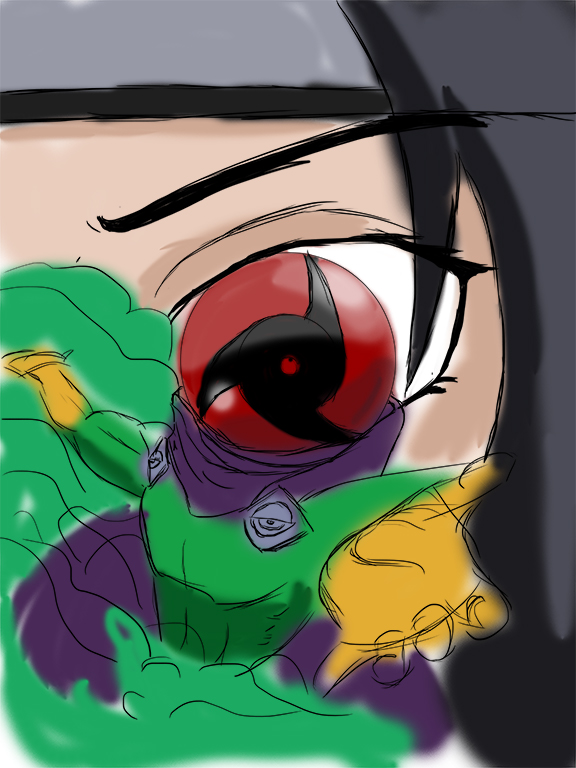
MysterioXItachiRoughsketch.jpg


oooh new thought. Maybe I should, instead of having Mysterio's helmet be just the Sharingan, make it the full eye. So the glass dome will have the white part of the eye with the sharingan only in the middle, or maybe even off to the side like a reflection in the glass. Either way I want the helmet in the foreground and Itachi's eye in the background to be the same thing, just testing out ways to do it.
 

Argentus

Well-Known Member
can't decide on actual colors for my character..(Which is a problem i have with MOST of my characters, really. Aside from the main guy, I have a helluva time pinning down what colors they should be)

GaleSapphireColorTest.jpg


the hands and feet are gonna need a lot more detail, i already know that, so i'm kinda ignoring those for now, but not sure I like her overall pallete. This was just a "slap it on so its not black and white" set of colors, but still...not sure PURPLE really works on her.
 

Argentus

Well-Known Member
That palette is nice but it's too similar to that of Zephyrmon. Soon as I saw her I thought of her.


Yeah that was part of the original inspiration, and I'm trying to get away from it. Gonna pale the skin but I don't wanna go"brown" for the clothes (native american inspired), nor do I wanna go sky blur because that's too close to the hair and wings and she would feel monochromatic
 

Argentus

Well-Known Member
before my photoshop trial ran out and I have to go back to gimp, I decided to go back to my old comic and try again. I tried to take @Tyaren 's advice and work on my pacing, so i compacted what was gonna be two or three pages into one. In the previous page he had just been hit by something.

Never tried motion blurs or anything before, so I just winged it. I need to sleep now since i work at 7am lol.

ZG_P0010.jpg


yeah it looks like crap but again, that's why I originally wanted to do the comic: to get in the practice.
 

Argentus

Well-Known Member
that's always been my problem, even back in school, to the point where I refused to turn in my assignments on time, so the rest of the class wouldn't see them, instead turning them in after class to the teacher only.

always felt like nothing I did was good enough, so I never bothered finishing. That's why I thought of this comic like 10-14 years ago (Original concept was when I was 14, but the current version is DRASTICALLY different, and it started changing to what it is now, around 2008) but still haven't...done it. even though I've thought up and planned out SO MUCH of/for it.


Did another practice sketch while testing colors for a character.
Felicia Color Test.jpg


really hard to shade a black outfit.

secretary/aide for the emperor.
 
Last edited:

Argentus

Well-Known Member
Trying a more "solid color" style.

FYI it's fanart of Pandamania, a one-off marvel villainess.

Thoughts of the WIP? (if anyone even sees this thread anymore lol)

PandamaniaWIP.jpg


I don't like how it's coming out so far (Was meant to look like she's jumping but didn't work, and I don't think the face matches the rest of the art style) but whatever, it's experience.

Side note, this was made in Manga Studio, which I just picked up. LOVING it so far.

1471246796-natural.png

Here somme tileset i draw for my game on the logicial "rpg maker" ;)

Awesome! I have RPG maker but haven't tried it yet.
 

Hayabusiness

Well-Known Member
Those balloon boobs don't look very good. I see you are trying to do some tricky foreshortening I can't work around, so I can't help you in that regard, but if you want tips on how to draw breasts, I could try to give it a go.
 

KasumiLover

xX_APO_Prince_Xx
Premium Donor
Trying a more "solid color" style.

FYI it's fanart of Pandamania, a one-off marvel villainess.

Thoughts of the WIP? (if anyone even sees this thread anymore lol)

View attachment 22168

I don't like how it's coming out so far (Was meant to look like she's jumping but didn't work, and I don't think the face matches the rest of the art style) but whatever, it's experience.

Side note, this was made in Manga Studio, which I just picked up. LOVING it so far.


Awesome! I have RPG maker but haven't tried it yet.
The pic looks good but like someone said, the boobs are kinda a BIT too much, but only a slight reduction would be necessary. Other than that, love how it's coming together so far, those eyes! ☆.☆
 

Argentus

Well-Known Member
Those balloon boobs don't look very good. I see you are trying to do some tricky foreshortening I can't work around, so I can't help you in that regard, but if you want tips on how to draw breasts, I could try to give it a go.
I don't mind tips, like I said, it was SUPPOSED to look like she's jumping/falling (Hence them being more "up") but...it didn't work XD.
 

Hayabusiness

Well-Known Member
@Argentus
Okei, I thought a bit about it on how I could explain myself here.
IMO, one of the best ways to approach drawing breasts is that you have to think about how they are not spheres attached to a body, but more like... muscle and fat inside skin. Gravity is very important. Don't apply gravity to two balloons but to bags of fat.
I hope this picture explains my thoughts well (and I also hope it's not too shoddy lol):
cutiemurabreasts.png
 

Sotherius

Well-Known Member
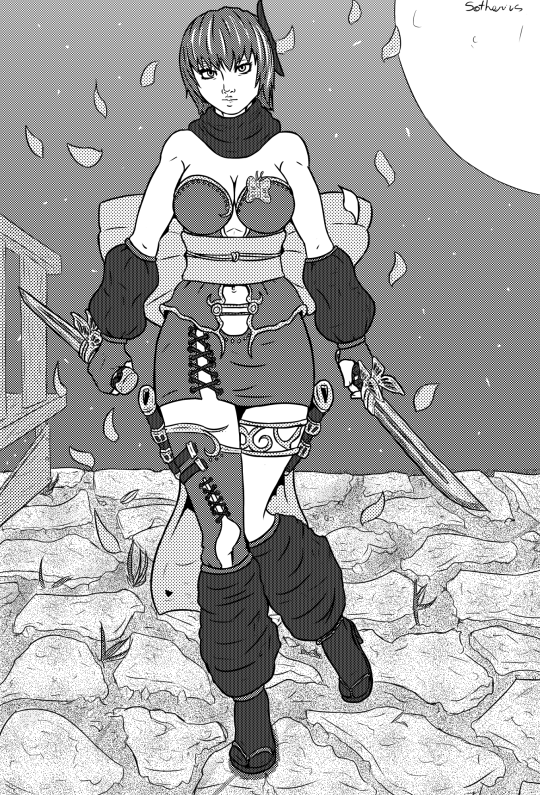
tumblr_oholptMVYV1uu9eyfo1_540.png


I would put this on the DOA fanart thread, but i'm really looking for criticism.

Things i can notice myself are how static ayane looks. In general i feel that i don't make things as dynamic as i should be trying at this point; This was the biggest experiment i did with Screentones, and i'm somewhat happy on how the came out, but the background is really a weak point both on screentoning and in the drawing in general, i'm clueless when it is about drawing backgrounds in general.

I want to follow that "finished not perfect" thing, and add colors to this, but i also want to move on, since i think this looks pretty finished as a b/w piece only, and i want to mess up with some character ideas that i have and move on from DOA fanart that is basically what i've been drawing lately.
 

Hayabusiness

Well-Known Member
@Sotherius
I like your use of screentones, but they make your drawing look flat without any sort of shading.
I think more depth added by lights and shadows might help your drawing look more dynamic.

Another thing that helps with dynamicity, imo, is drawing fast lines.

drawingtest.png


The first two lines I drew with a quick hand, the second ones were done more slowly.
A slow hand is hard to keep still and you need years of training to have good experience.
A fast hand makes pictures much more dynamic and quick. It also takes practice but it's one of those things that's hard to improve without constant practice.
Here is a good (albeit a bit extreme) example of what I mean:

2qaHgze.jpg


Although, to be honest, I don't need much of your picture needs to be more dynamic since Ayane is standing still.

On the bg:
I am quite clueless on backgrounds too, but in your picture, I think adding more details and more tones to the sky might help. Also more shadows and lights (like how I said with Ayane). For example, if Ayane casted a stronger shadow, she would feel much more part of the scenery than glued on top of it.
Shadows help a lot in giving depth to a picture and making everything more harmonious.
 

Sotherius

Well-Known Member
Yeah, it makes sense working on the shadows, i haven't figured out the entire thing with screentones, but i normally try to put some depht on my linearts by adding lines in darker places and such.

About fast lines, implementing that on my line work would be a pain, since i try to keep, let's say, everything well contained.

Thanks for the advice in general, i'll see how it will apply to my future pieces.
 

Sotherius

Well-Known Member
sjytRee.png

Ok, like i said, i'm moving on to projects of mine, sort of. And i have this character's ideas, that i'm trying to build movesets and "sprites" for them, and i'm struggling here, i want to make a basic stance for this female character, it has to keep a very feminine silhouette, the character has mostly heavy metal elements in her design, i'll show how she is in my mind later, since the pictures i have of her are a bit obsolete, but in general, i'm not satisfied with this, i want a stance that looks natural and feminine.

EDIT: changed the right picture to represent a bit of her design.
 
Last edited:

Kodachi

Well-Known Member
Standard Donor
@Argentus
Okei, I thought a bit about it on how I could explain myself here.
IMO, one of the best ways to approach drawing breasts is that you have to think about how they are not spheres attached to a body, but more like... muscle and fat inside skin. Gravity is very important. Don't apply gravity to two balloons but to bags of fat.
I hope this picture explains my thoughts well (and I also hope it's not too shoddy lol):
View attachment 22169
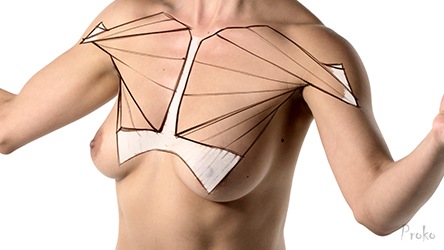
I love your style so much, very clear in your explanation. I find Its also important to see whats underneath the breasts
Pec-and-Breast-Tissue-Outline.jpg

This video very helpful as well @Argentus
If you're gonna draw senran kagura balloon tiddies make sure the motion and form is based on realism.

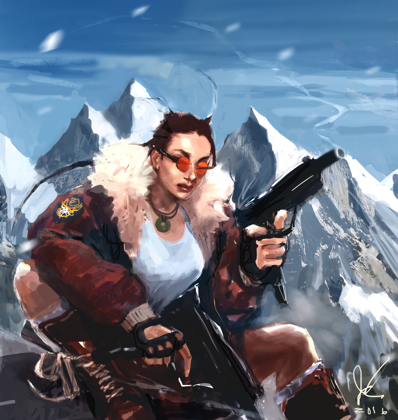
Speaking of tig ol' biddies Fan Art of OG Lara Croft
tumblr_ohr7knUrSr1vqk7wyo1_1280.png
 
ALL DOA6 DOA5 DOA4 DOA3 DOA2U DOAD
Top