
You are using an out of date browser. It may not display this or other websites correctly.
You should upgrade or use an alternative browser.
You should upgrade or use an alternative browser.
Halloween DLC 2014
- Thread starter Kodachi
- Start date
- Status
- Not open for further replies.
tbh you would think Ayane would get something somewhat demonic for halloween (maybe a female tenguesque outfit, or idk a satanic butterfly) since she already has the eyes and hair color for something like it. anything is better than that fucking succubus i'm forever pressed over it but i'll end up buying it anyway just because i won't tolerate staring at a locked costume for my main character also congrats to the designer for having their design put in the game tho
AsheMann21
Well-Known Member
It seems as though TN is unaware of the leak. They're still posting teases
Darkton93
Well-Known Member
I don't think anyone is saying they won't buy the pack...
I won't be buying any of these.
Still not gonna get it
You were saying?Guess I'm not buying anything from this pack.
Jaguar360
Well-Known Member
I have pretty mixed opinions on this pack. I'll talk about the ones that are notable to me.
 I like that it's maskless and I think it's a unique design, but I'm not really feeling it. Mediocre as a whole IMO.
Hayate's looks cooler than Ryu's for some reason, but still a tad mediocre. I'm considering buying this one though if I can.
Still enamored with her costume <3<3
All the pirates look great! Good designs on all three.
Both very cool. Especially Jahn Lee's because of the color scheme.
It looks good overall, but still kinda meh.
Both great grim reaper costumes! Some of the best in the pack.
Looks good.
Great design, though I probably wouldn't use this.
Yeah, it's recycled, but it looks awesome on him nonetheless. I still need to see the astronaut costume that didn't make it in though. I feel sorry for that artist. :/
Katsune costume looks very nice on her!
Nice witch costume
...Poor thing
I like that it's maskless and I think it's a unique design, but I'm not really feeling it. Mediocre as a whole IMO.Hayate's looks cooler than Ryu's for some reason, but still a tad mediocre. I'm considering buying this one though if I can.Still enamored with her costume <3<3All the pirates look great! Good designs on all three. Both very cool. Especially Jahn Lee's because of the color scheme.It looks good overall, but still kinda meh.Both great grim reaper costumes! Some of the best in the pack.Looks good.Great design, though I probably wouldn't use this.Yeah, it's recycled, but it looks awesome on him nonetheless. I still need to see the astronaut costume that didn't make it in though. I feel sorry for that artist. :/Katsune costume looks very nice on her!Nice witch costume...Poor thingwerewolfgold
Well-Known Member
Companies can't "officially" acknowledge the existence of leaks. They have a set schedule for promotions and all that stuff.It seems as though TN is unaware of the leak. They're still posting teases
Yes they can. When ME3 got leaked EA/Bioware released a big QQ statement and wound up changing a bunch of shit in spite.Companies can't "officially" acknowledge the existence of leaks. They have a set schedule for promotions and all that stuff.
Number 13
Well-Known Member
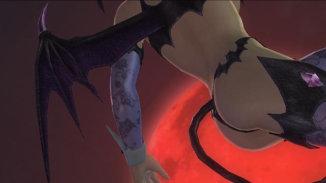
These pictures might still be useful since they will show more angles we haven't seen yet for the costumes. Now we can confirm that Ayane indeed will show ass.View attachment 7702
It seems as though TN is unaware of the leak. They're still posting teases
David Gregg
Well-Known Member
You were saying?
Okay, the majority of us aren't saying that. Feel better now?
Not to mention people say they aren't going to buy it and end up buying it anyway. That's phase 3 of your cycle remember?
Last edited:
Kasumi too since her costume is basically just a white and pink version of Ayane's.These pictures might still be useful since they will show more angles we haven't seen yet for the costumes. Now we can confirm that Ayane indeed will show ass.
Xhominid The Demon Within
Well-Known Member
Kasumi too since her costume is basically just a white and pink version of Ayane's.
And the more skin Kasumi shows, the more me likey!
RoboJoe
Well-Known Member
Yes they can. When ME3 got leaked EA/Bioware released a big QQ statement and wound up changing a bunch of shit in spite.
EA and Bioware are retard central. It doesn't surprise me when they go against the standard professional approach to leaks.
Alright, time for my thoughts on this pack now that I've let initial hype/disappointment peter out:
- It's okay, but a mask instead of face paint ruins it. 5/10 - I like the colour scheme, but it's lame overall. 1.5/10 - AMERICA!! FUCK YEAH!! 10/10 - He looks like he came from South Park's version of hell. 4/10 - Pirate theme suits Brad better than any other character. A perfect match, but pirates are lame. 8/10 - Boring. 4/10- It's a pirate. 6/10 (10/10 if he can wear shades OVER the eye patch)- A bottom tier outfit for a bottom tier character. The concept art was far better. 3/10 - It looks alright, but it's still a pirate. 7/10 -The red oni/blue oni outfits could have been good if they changed their skin colors. Missed opportunity. 4/10 - I really hate the outfits that look like dollar store halloween costumes (eg last year Mila/Sarah/etc) The spider web gives that vibe. 5/10 - No words. 1/10 - Too hard to tell from the angle, but it seems okay. - Looks awesome. 9/10 - It sucks. 1/10 - If tail 7/10, If no tail 4/10 - I will take a recolour of a good outfit over a crappy original any day. 8/10 - Gives Urusei Yatsura vibes. 7/10 - Suits him better than Brad Wong, but still weak. 5/10 - If I didn't like it when Sarah had it, I won't like it when her mini-me has it. 2/10 - Until the leak, I always thought this outfit was for Kokoro, lol. 5/10 - Many good details were lost, though I expected that. Don't care for the result. 5/10 - It's like Leifang, but crappier. Is this a statement from TN? 5/10 - It looks okay, but loses points for the toy scythe. 5/10 - It looks better than I thought it would. 5/10 - Would look better without the scythe. 6/10 - Same deal as Hayate. 4/10 - If it's just a nurse recolour. 1/10 (which is still better than her last outfit) - Looks great. 8/10 - If you can remove the stupid hat, 8/10, else 7/10WisperG
Well-Known Member
AsheMann21 said:It seems as though TN is unaware of the leak. They're still posting teases
they probably are aware. I'd be surprised if they weren't swarmed with Tweets about it by now.
Either way, there is no reason for them to stop until they're done. Team Ninja's DLC plans don't revolve around random JP image sites, FSD/DOAW and GameFAQs. TN has a lot of Twitter followers. The odds of every single one of them having seen the leak are nonexistent. Those of us that have are probably in the minority.
I think it's really silly to think that TN would actually change anything because a few fansites happen to know what costumes will be in the Halloween pack a few days early. It's just not that big of a deal. I doubt few beyond us really care very much.
Darkton93
Well-Known Member
Hence us getting 10,000 more bikinis and fetish outfits. That money's not going to this, so they're gonna want to play it safe and give us more fetish stuff because that actually sells.Nah when I say I don't buy something I instead buy something else with that money.
Chapstick
Well-Known Member
I'll wait until the trailer releases to give scores, some of leaks you can't see too much. Right now I'm digging Tina's, Rig's, Hayabusa's, Phase 4's, Bass's, Ein's (love a sexy pirate... *cough*), and even Leon's.
^Buy this or we'll get more of... This. I'm gonna guess this and Kasumi's will sell the best out of the entire pack, sending TN a clear message
Hence us getting 10,000 more bikinis and fetish outfits. That money's not going to this, so they're gonna want to play it safe and give us more fetish stuff because that actually sells.
^Buy this or we'll get more of... This. I'm gonna guess this and Kasumi's will sell the best out of the entire pack, sending TN a clear message
Number 13
Well-Known Member
The reason why is that more people in the overall (not competitive) community/fanbase (even in the western audience) are buying those outfits (more news at 11 sexy sells) not because I refuse to buy x pack because it's not like I'm buying those kind of outfits either. I'm not contributing to the problem, but I'm not helping to resolve it either because from my perspective TN is not giving me much incentive (in terms of costume dlc quality) to even care about resolving it.
Don't see the logic of me of having to throw money at a bunch of outfits I would hardly use for the chance of my character getting a bone who is in the bottom of the barrel (he is a male) of the barrel (one of the worst treated for even males). Yeah would rather just buy a game or have a nice dinner then play the lottery with TN with that money.
Don't see the logic of me of having to throw money at a bunch of outfits I would hardly use for the chance of my character getting a bone who is in the bottom of the barrel (he is a male) of the barrel (one of the worst treated for even males). Yeah would rather just buy a game or have a nice dinner then play the lottery with TN with that money.
Argentus
Well-Known Member
Though that is a really cool still. Looks like a dark stalkers pose or something .View attachment 7702
It seems as though TN is unaware of the leak. They're still posting teases

Buy this and we'll get more of... this:

werewolfgold
Well-Known Member
Well, "can't" wasn't the right word. They usually don't and it's not surprising if TN wouldn't. MK9's entire roster got leaked for instance. They still just revealed characters as usual. Things get data mined and stuff. I don't think Nintendo said anything when Smash 4 characters started leaking. But, they still have to keep to the release schedule. Usually the line goes "We don't comment on rumors and speculation" or some such. Even if it does get "acknowledged" (I think Seth Killian said something when UMvC3's characters were leaked), it probably doesn't change the "official release" schedule any.Yes they can. When ME3 got leaked EA/Bioware released a big QQ statement and wound up changing a bunch of shit in spite.
- Status
- Not open for further replies.