LethalKasumi
Active Member
its like she gained some weight.
A girl gotta eat her food

its like she gained some weight.
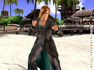
i hope leon or bayman or bass or kokoro gets chest hair cause these ken doll bodies are not doing nothing for me

It's really not that big of a deal, I could go on about Ein's redesign in DOA5 but it really doesn't matter its still the same costume but now with the added bonus of some sweet shades and a hot guy underneath them lol
Though, I do wish his mesh shirt actually was a mesh shirt and not a brown mess shirt.

I mentioned before how I preferred the DOA3 version of Hayabusa's ninja's outfit over the mess we got later on and the same goes for Ayane's main DOA2 costume. I really like the Yellow ribbon from DOA3 over that ugly orange ribbon she got in U2 and later games
I am probably alone on this one lol
You are right on this one and traditional color theory agrees with you because violet and yellow are complementary colors.
Violet and orange are a bit off that balance and don't mesh as well.
On top of that the specific shades of violet and orange are particularly ugly together. The violet is too dark and desaturated and the orange is too dark as well but too saturated. The designer seemed to have an off day.
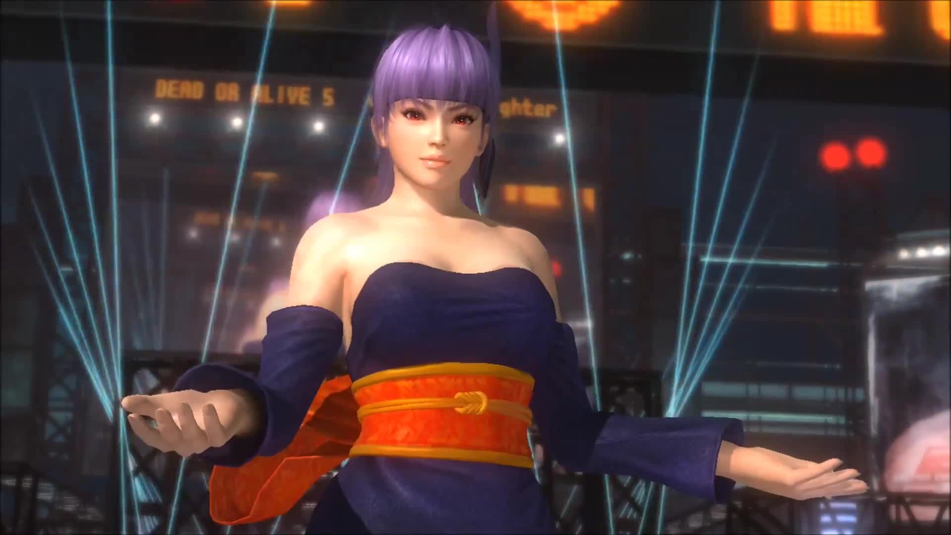
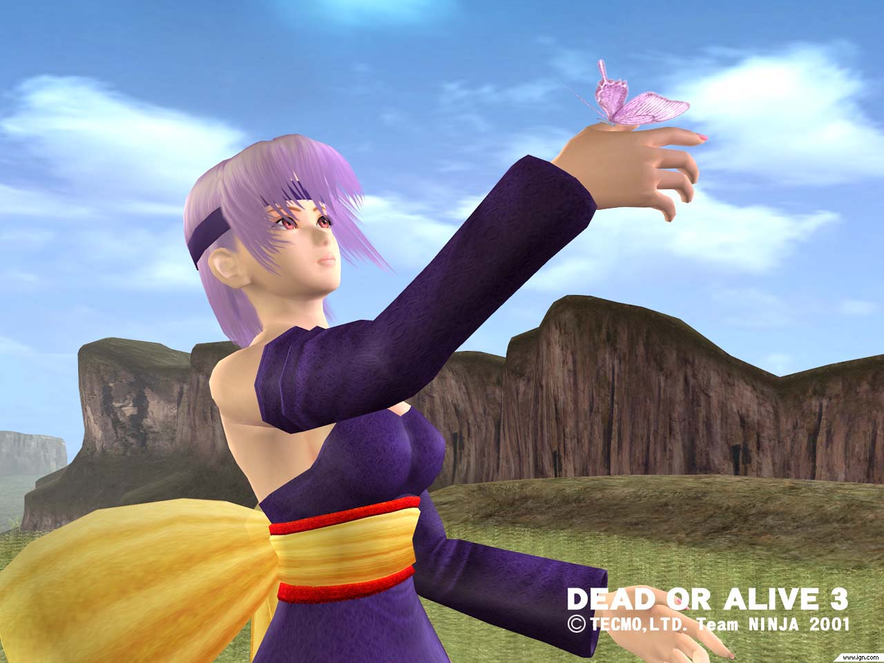
I by the way always really liked that costume. It is THE iconic costume of Ayane, like the classic, blue garb is Kasumi's iconic costume. It however only really works in the anime style games of the series. It looks off since DOA5 embraced a more realistic art style. The magically fixed in place arm parts are one reason, lol.
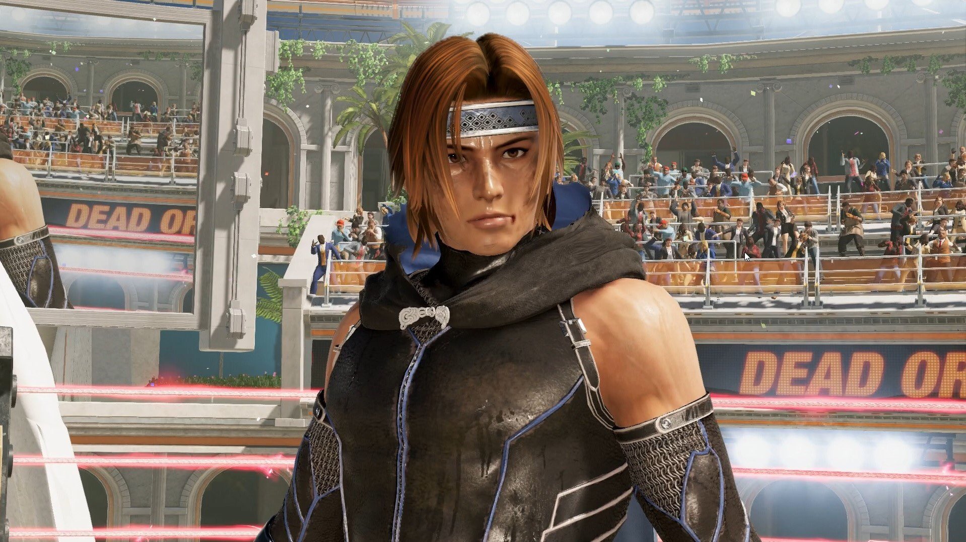
new image..

I don't think the realistic approach is the problem, I think it is because the textures did not pay them justice. Look at Helena's C2. It looked like really bad latex.
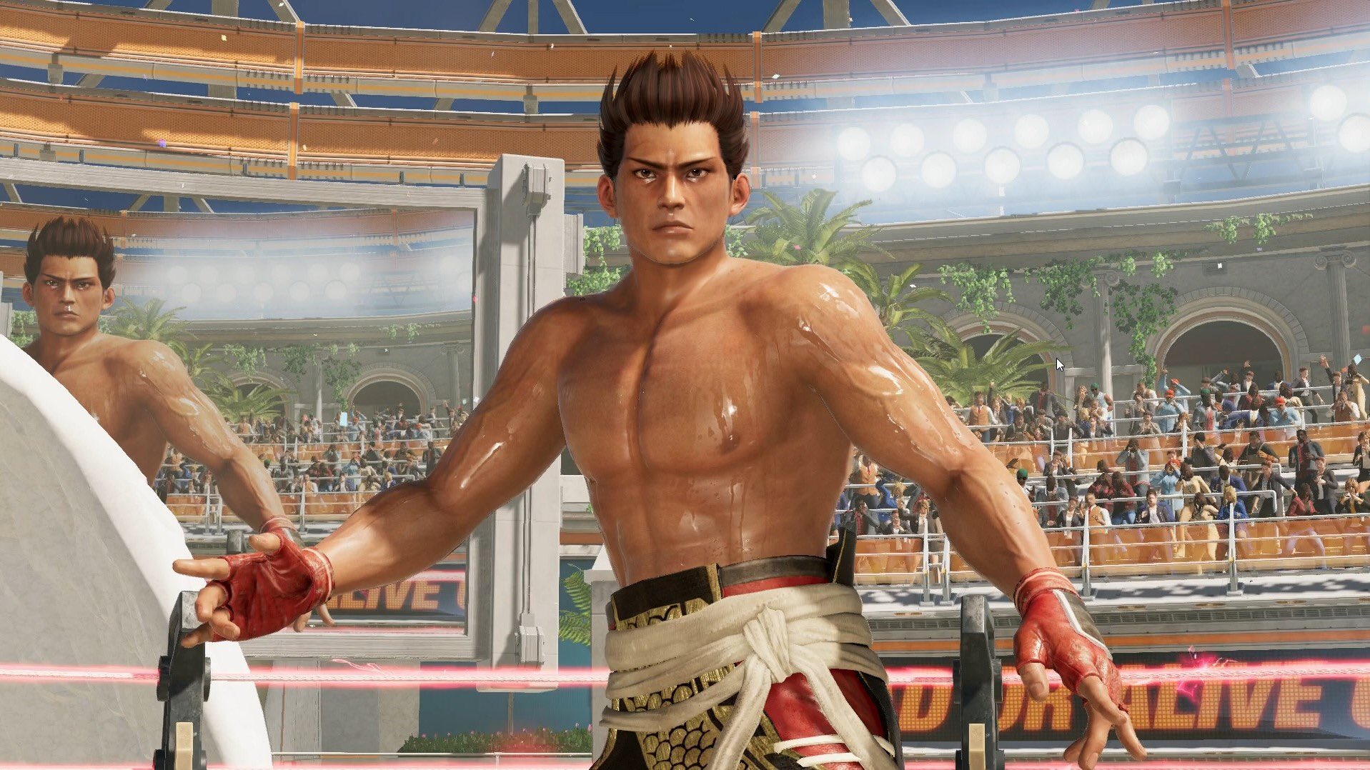
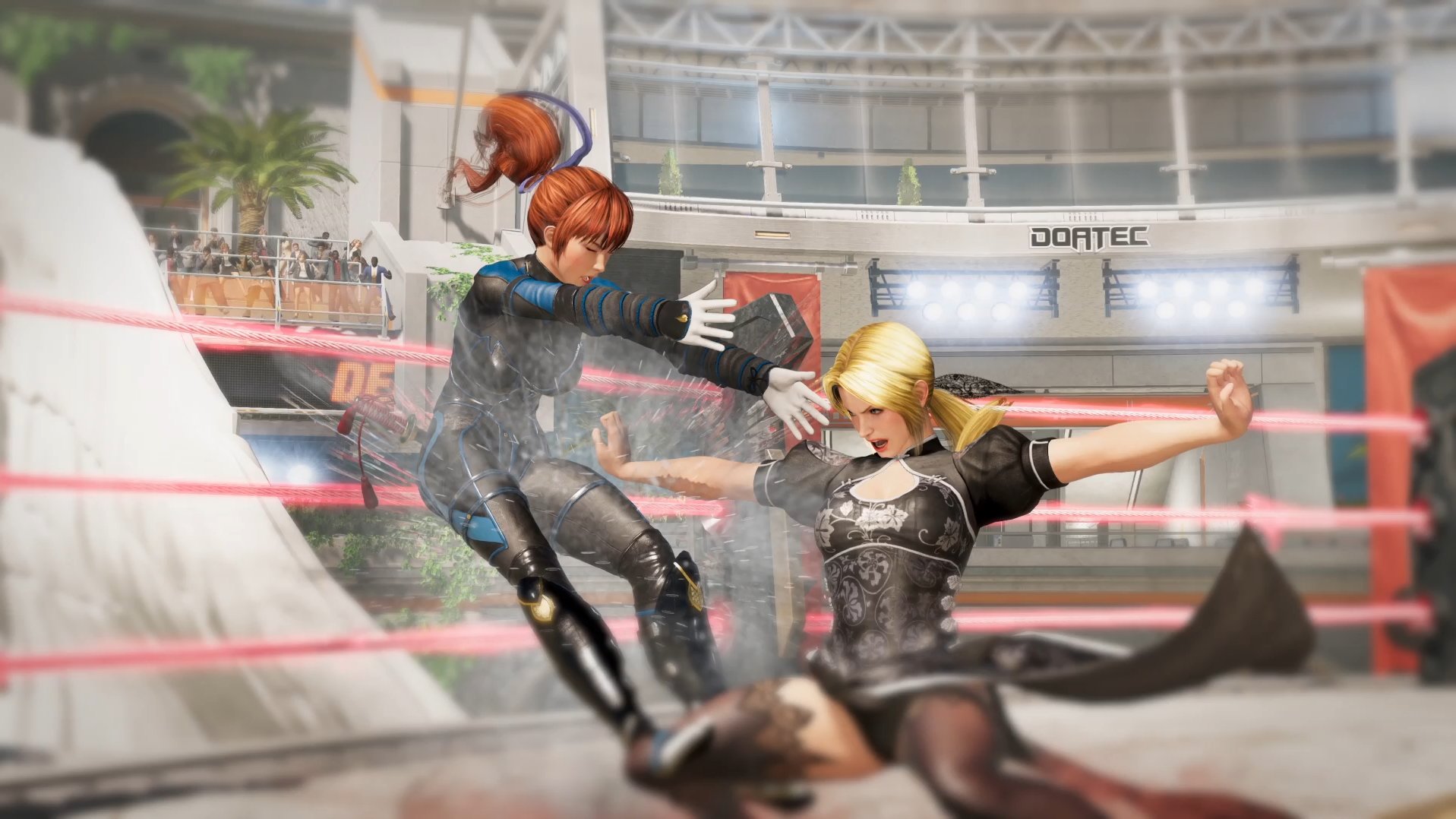
That and "Look Kasumi still has peppermint creams!".TN has been using screenshots from the trailer for a few days. It's time for new content now!
Helena looks wild, that face is so "vulgar". Love it.
Also, that picture is like it's saying "look, we still have cleavage and panty shots" to reassure the angry immature spammers.
new image..
( Which I've said before but I'll say again It's a pre release image from before doa5 even came out, before the finished release her hair would become Brown and her skin darkened to how it should be but it hadn't been yet at that point ) but anyway I'm extremely excited to see how she'll look in doa6. Hmm...For some reason I stopped getting alerts from this thread on Friday?...maybe it was to save me from seeing that image of Lisa you posted @Tyaren ?!

First Lisa image was leaked:
I like the traditional African garb.
"